One Tuesday every month, I’m going to round up a couple (maybe a few) awesome display typefaces to showcase and give a little breakdown on each one. If you have a suggestion you want me to take a look at, drop me a line. Let’s jump straight into some headline goodness.
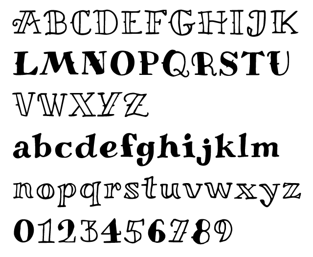
Miltonian
Foundry : Pablo Impallari
Designer(s) : Pablo Impallari
Cost: FREE
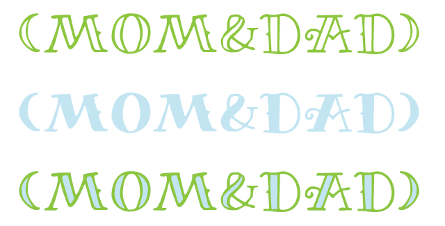
So, I was perusing the Google web fonts list and noticed this addition by the same guy who did Lobster which I already showcased a while back. The trend of the two versions — one open and one fill — strikes again. The typeface references a distinct tattoo style with its rough edges, high contrast, and slight embellishments. It’s because of the unevenness that a long text setting never gets into a real rhythm. It does have punctuation, accents, and enough characters to cover the Latin character set so there is some flexibility there.
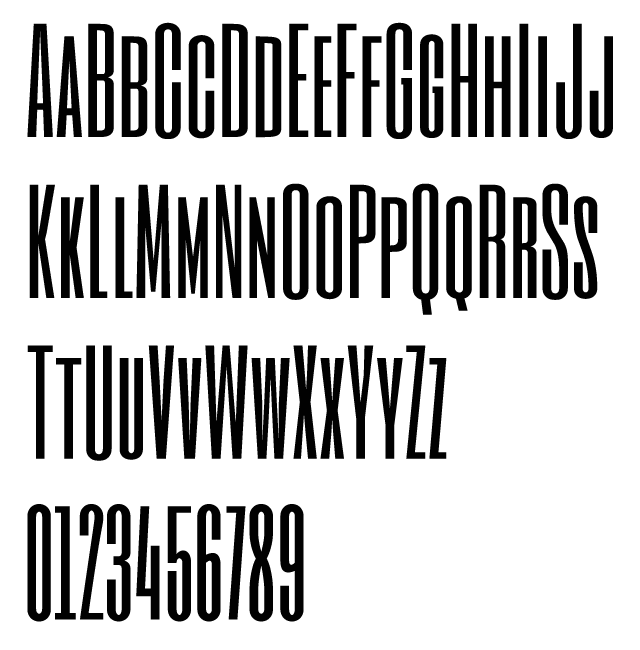
Six Caps
Foundry : newtypography
Designer(s) : Vernon Adams
Cost: FREE
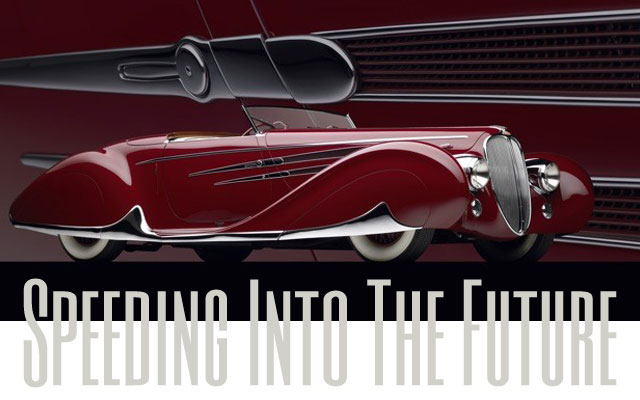
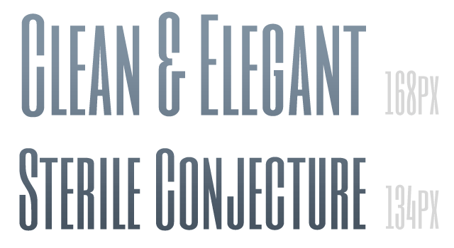
Another typeface on the list the stuck out to me for setting headlines, was this Six Caps by Vernon Adams. An extremely condensed sans serif, these letters are tight. Text setting is out of the question as it is an all-uppercase font with the lowercase replaced by a small-caps copy of each letter. So you’re basically typing in ALL CAPS all the time. But, say you wanted to set the first word or two of paragraph apart in drop-cap fashion; then Six Caps might be a great choice. Or if you need to squeeze a four word bit into a tiny space, the economy of these letters tightness might just do the trick. That condensed form does lend to a modern, streamlined feel so be aware of that when using Six Caps.
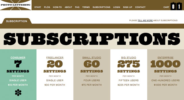
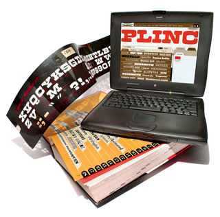 And finally, I’d like to mention something different. It’s not a font or typeface per se but it completely falls in the realm of display typography and setting headlines. House Industries has finally released their Photo-Lettering project. It allows you to set some type with old PLINC alphabets, set layering colors, maybe some alternate or ligature options then buy the headline and receive it as a vector that you can mess with some more or drop into your design. They have started out with 38 styles and say they plan to release more. Definitely worth taking a look at and playing with a little bit. The interface is wonderful and intuitive; everything works like a charm. The site itself looks great as to be expected.
Now for the critical part. I’m not sold yet on the pricing or really the whole business model. I think of fonts as an investment in a tool that I can carry around in my toolbox and pull out whenever the need might arise. With a font installed on my computer, I can tweak and style and size to my hearts content in a Character palette. I can access all sorts of OpenType features.
Then again, maybe I’m not the niche audience. I’m a graphic designer with the Adobe Creative Suite and tons of knowledge on how to use those programs. You get a vector PDF which can be edited in Illustrator but more importantly, could also just as easily be dropped into someone’s Office Word document above a page of Comic Sans.
That shouldn’t sound too harsh because I don’t mean it to be. I think there is a definite cost/benefit analysis to be done based on the quantity of headlines that you need. I still totally recommend that you check it out. Heck, even sign up for an account and get one FREE setting to download. Then let me know what you think in the comments.
