Hooray for the start of a new series! I’m still organizing my editorial calendar, so I’m not quite sure what the frequency is going to be yet. This will be a regular post where I showcase and breakdown one or two awesome display fonts I have come across. Let’s jump straight into some headline goodness.
Aeronaut
Foundry : FaceType
Designer(s) : Georg Herold-Wildfellner
Cost: $49 USD
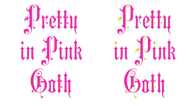
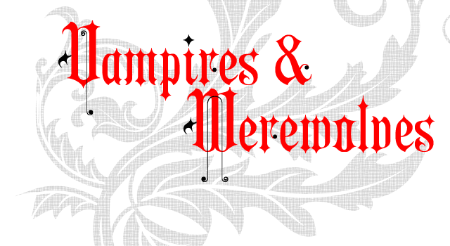
From the guys at FaceType, this Neogothic typeface is sooo-weet! You can read a little background on their source material (an 1879 German font book) and of course buy your copy of the font over at their website.
I chose Aeronaut because it straddles a line between the obvious heaviness of its Gothic roots and the modern feel of the straight line and ball terminal swashes that are mixed in to the letters. I find that an incredible feat to pull off. Want to make it even more modern? The base letters and swashes have been separated into three fonts that can be overlaid with multiple color combinations.
Besides its obvious uses in Medieval period pieces like a Renaissance Fair poster or perhaps something about Gutenberg, Aeronaut is also a great choice for trying out a monogram or initials. That’s how I ran across it and it worked out great with the letters I needed to use.
Folk
Foundry : Tipos Pereira
Designer(s) : Marcelo Magalhães Pereira
Cost: FREE
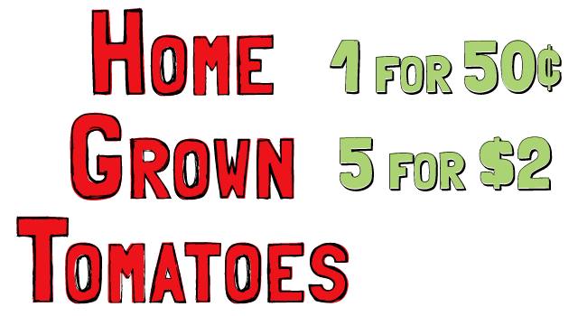
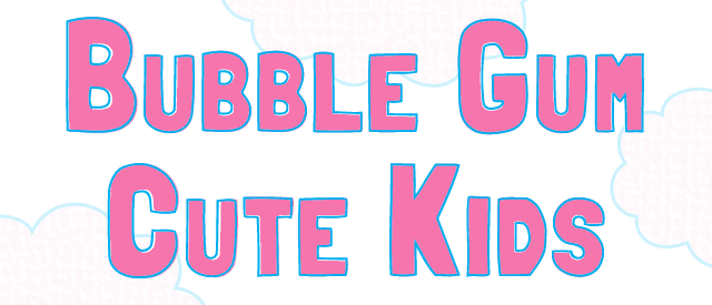
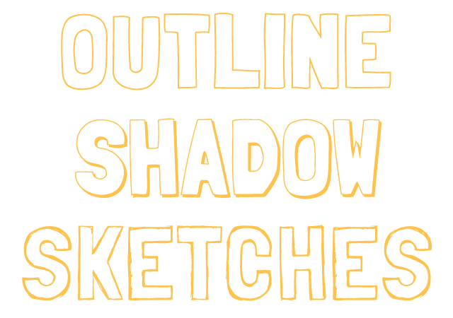
I ran into Folk while searching through Font Squirrel.com, which is a great site for all kinds of free fonts and especially for @font-face kits for web fonts. Folk stood out to me for the same reason Aeronaut did, the ability to combine its four options with multiple colors to create different looks. It starts with a solid letter form that can be combined with an outline or an offset shadow or a sketchy outline. Mix and match the colors and you can come up with some very interesting and attractive looks.
True to its name, Folk is very folksy. It reads right off a hand painted folk art sign that you might find at a city craft festival. Its bubbly feel also lends it a childish charm. Dare I say it, you could replace Comic Sans with it. Well, not really. The biggest drawback with Folk is its character set. There is no lowercase; everything is a capital letter. The font is made to work like a small caps style, with the uppercase letters scaled smaller and mapped to the lowercase. It does have a full set of numerals, punctuation, and accented characters so it has that going for it.
I might set a two or three line sentence if the mood and words were right, but I think of Folk as more of a headline and display type which is why it made Headline Heads Up.

