One Tuesday every month, I’m going to round up a couple (maybe a few) awesome display typefaces to showcase and give a little breakdown on each one. If you have a suggestion you want me to take a look at, drop me a line. Let’s jump straight into some headline goodness.
So, I sat down to round up some good display faces today and sitting in my email was the latest Rising Stars from MyFonts. It’s like most of my work — at least the searching — was done for me. So that gave me a good starting point, and I just wanted to give credit where credit is due.
Delight Script
Foundry : Sudtipos
Designer(s) : Angel Koziupa, Alejandro Paul
Cost: $59 USD
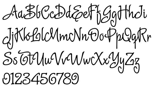
Any conversation about script typefaces must include the Sudtipos foundry of Buenos Aires, Argentina and they continue that conversation with Delight Script. Super fun, with plenty of quirk — take a look at the capital “F” and “L” — it has the special OpenType touches of several stylistic alternate characters that makes Sudtipos stand out.
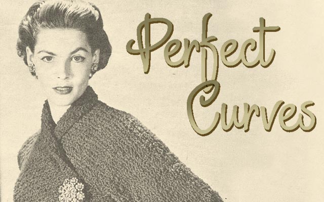
The script is bouncy and has the awesome feature of mimicking a sign-painter’s need to reload the brush with ink by having some letters break the connecting flow of letters. Notice below the three distinct parts of “A” “mer” “ican” as an example. This definitely can pull off a vintage look if that’s what you need, but also suggests a contemporary sweet tooth for candy packaging. Get you copy today!
Skitch
Foundry : Yellow Design Studio
Designer(s) : Ryan Martinson
Cost: $20 USD
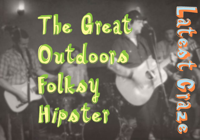
Now this is a versatile font. I seem to love the fonts designed to be overlaid and setup for multi-color use. Skitch has a solid version but where it looks real nice is when the open and fill styles come together with the slight offset. All three are shown together in the sample above. Coming from its hand drawn origins, the rough edges and unevenness give it a very natural quality. This also holds it back at smaller sizes as things get a bit jumpy and the details disturb the flow of reading.
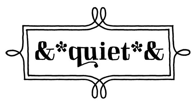
Other features that make it a great headline type include some nifty ligatures of the ball terminals, about 100 extra beyond “fi” and “fl” including those shown below — “ra” “ch” “es”. Another awesome feature — an entire second set of uppercase, lowercase, and numerals with slightly different contours under an OpenType stylistic alternate option. This can increase the hand drawn quality by introducing variation among letterforms.
And finally to round out the awesome goodness of Skitch — there are a set of Border Fonts and Ornament Fonts following the same solid, outline, and fill setup. Those can go a long way in helping set great looking headlines. Plus, check out those awesome ampersands and asterisks!
HVD Steinzeit
Foundry : HVD Fonts
Designer(s) : Hannes von Döhren
Cost: FREE
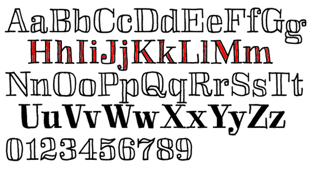
Let’s keep with the hand drawn, multi-layered theme but in a completely different style. These rough block letters are crude cut-outs with a ransom letter look. It’d be perfect for band posters or a kids book — those are two really different things which is why I think this typeface is a good choice to have in the toolbox. There aren’t any fancy OpenType features like ligatures or alternates, but there’s a full set of punctuation and accented characters so that’s not holding it back. Take a look and see what you can do with it!
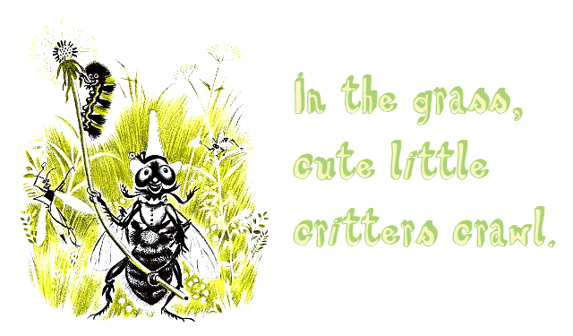
The above illustration is copyright Feodor Rojankovsky — 1956 Caldecott Winner — and was originally published in John Langstaff’s ‘Frog Went A‑Courtin’!
