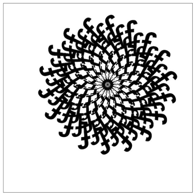
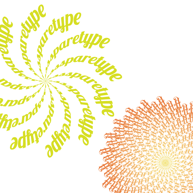
I was helping someone understand type on a path and how to arch, warp, & bend text when I thought of this really cool idea. The following tutorial will show you how to build interesting spiral shapes with a simple string of letters using Adobe Illustrator and the Warp Effect Arc.
Example of the Final Product
Tutorial Details
Program: Adobe Illustrator CS3
Difficulty: Beginner
Topics Covered: Warp Effect, Smart Guides, Rotate Tool
Estimated Completion Time: 15–20 minutes
Required Files: None
Step 1
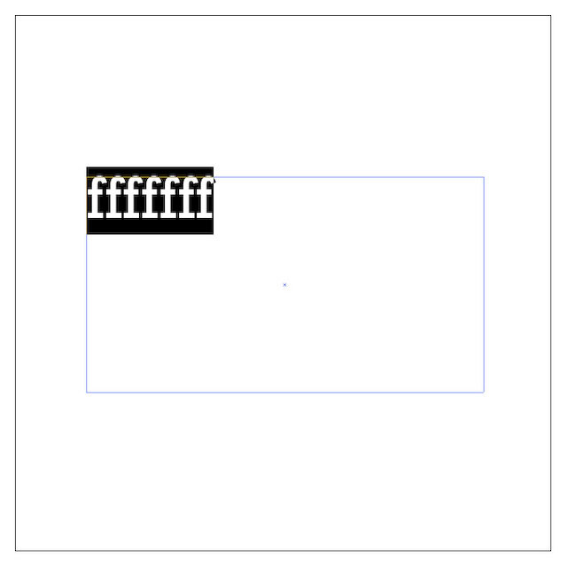
Create a new document and create a text box with the Type tool(T). Type out just one line of text and choose a font.
Step 2
For this example, I am using the letter ‘f’ set in Rockwell Regular. Starting point size is not important as the effect is percentage based and will work the same whether you start with 12pt. or 200pt. type.
Step 3
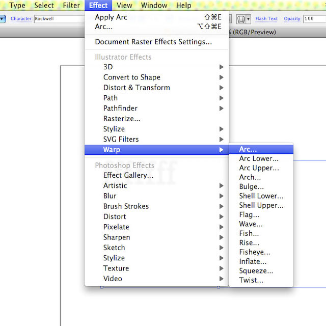
Switch back to the Selection tool(V) then click on Effect > Warp > Arc.
Step 4
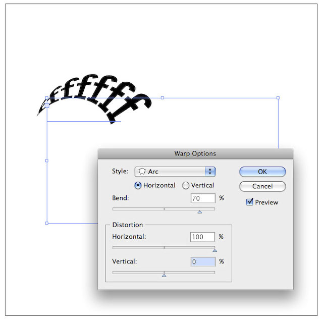
Adjust the Bend to 70% and the Horizontal Distortion to 100% then check the Preview box to see the results. Depending on your letters you might want to move the Bend to 60% or 80%.
Step 5
Click OK when your Arc looks right. This is the arm of your spiral. Then click on Object > Expand Appearance.
Step 6
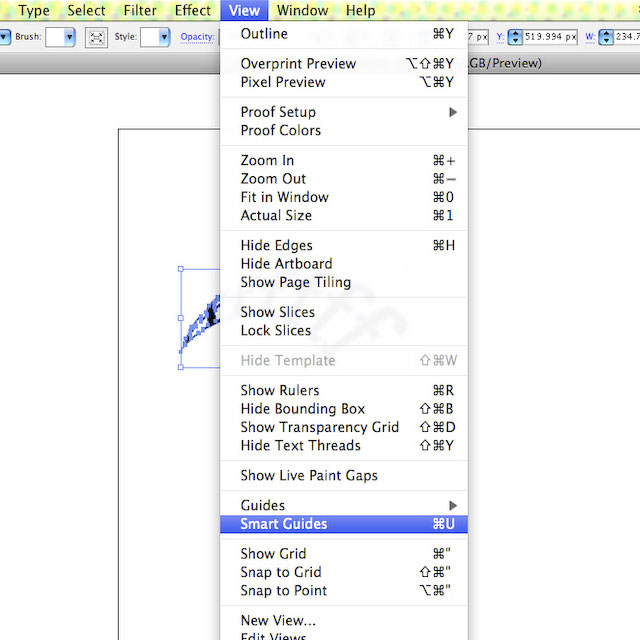
If Smart Guides are off, click on View > Smart Guides.
Step 7
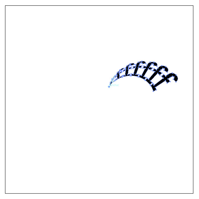
Switch to the Rotate tool(R ) and hover over your object. Your looking for the single anchor point where everything bends in together. The Smart Guides should snap you to it.
Step 8
Option + click on the anchor point to move the rotate point and bring up the rotate dialog. Use 20 degrees for the rotation and click Copy.
Step 9
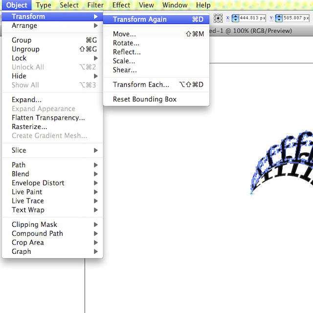
Use the keyboard shortcut Command + D to transform the new object again.
Step 10
Continue to hit Command + D sixteen more times to complete the spiral.
Step 11
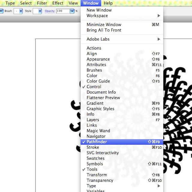
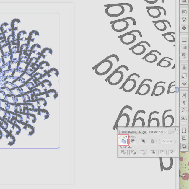
Use the keyboard shortcut Command + A to select all of the individual objects. Then click Window > Pathfinder > Add.
Step 12
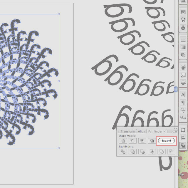
The last step is to click Expand in the Pathfinder palette to unify everything into one object.
As always, play with the settings and see what you come up with. Changing the amount of rotation is a quick way to come up with different looks. Then there is your type choice. The more decorative your typeface to begin with, the more intricate the resulting spiral will look. Here are two more examples I came up with just playing around.
