One Tuesday every month, I’m going to round up a couple (maybe a few) awesome display typefaces to showcase and give a little breakdown on each one. If you have a suggestion you want me to take a look at, drop me a line. Let’s jump straight into some headline goodness.
GRN Burgy
Foundry : Marco Goran Romano
Designer(s) : Marco Goran Romano
Cost: FREE
First up this month is the bubbly GRN Burgy. It screams 70s retro at the top of its disco lungs. With built-in reflection highlights and elongated proportions, the letterforms create unique and interesting negative spaces. GRN Burgy is great inspiration for any food related project — especially anything to do with fast food culture. See more great examples and download the font on Behance.
Cabin Sketch
Foundry : Impallari
Designer(s) : Pablo Impallari
Cost: FREE
I love sketch typefaces. I love seeing the human touch of the hand on screen. Cabin Sketch is a hand drawn version of Impallari’s Cabin — a humanist sans-serif inspired by the typefaces of Johnston and Gill. This gives the letters a very solid base before the slight bumps and jitters are added. It also has the great features of coming in both a regular and bold weight along with being hosted on Google Web Fonts. It looks great large, but again because of the solid forms it is based on can also be used smaller too.
Old Press
Foundry : Galdino Otten
Designer(s) : Galdino Otten
Cost: FREE (for personal use)
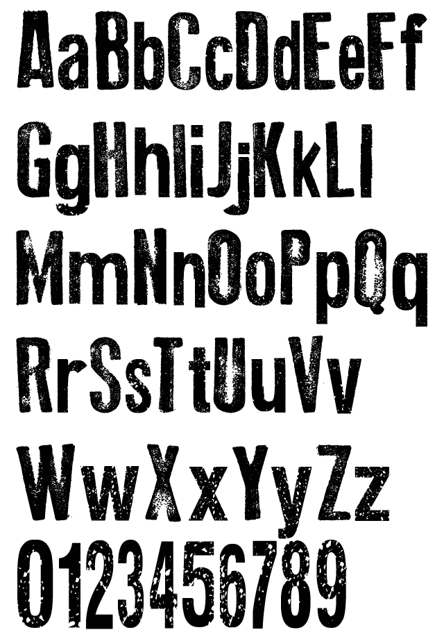
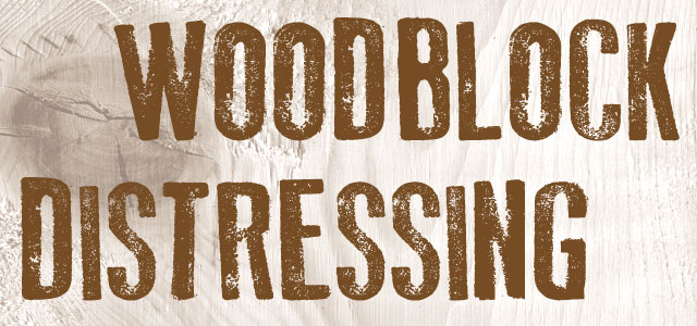
Distressed typefaces are another area where variation and the intricate interplay of positive and negative spaces come together to create something interesting and unique. In other words, distressed is awesome. With some unique proportions — for example, the height of the crossbar on the “A” versus the bowl and leg of the “R” — Old Press has a human look and personality more so than a colder, Swiss sans-serif. The rough edges and distressed spots reinforce that feeling of the letters being hand touched. And though Old Press does not have any extra glyphs to create variations in the amount of patchiness, that shouldn’t be a problem when setting short headlines. If you’re interested in getting your feet wet with the woodblock look, get a copy of Old Press to try out some ideas.
Estelar
Foundry : Emilio Correa
Designer(s) : Emilio Correa
Cost: FREE
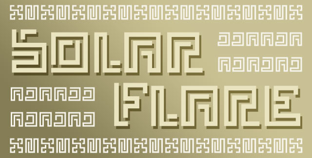
Last on this month’s list is an experimental font by the name of Estelar. A creation of straight lines and 90° turns, the type is more shapes than letters. Inspired by Pre-Columbian art and architecture, the shapes definitely capture the look of decorative border treatments seen in these pieces. As experimental as it is, readability is non-existent and legibility is tough for some characters. If you have the right word though and are looking for a splash of South American styling, Estelar might be perfect. Otherwise, it would be a useful tool for creating simple patterns for use in borders or backgrounds as illustrated below.


Old Press font is not Free.
Hey José, I updated the post to reflect free for personal use.