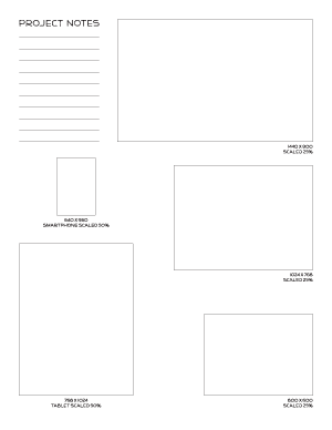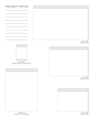
 I sat down today to start sketching some ideas for a responsive web site design. Imagine my surprise when I searched for a simple, letter-sized template of window sizes only to find one result. I wanted something a little different, so I made my own.
These pages are for early stage wire-framing and sketching since the windows are scaled 25% — 50% of what they will actually become. I found it useful to have them all on one page so I could easily see the differences in aspect ratio and size. I didn’t spend much time sketching on these pages before moving to larger sheets with grids, but they helped me get ideas started for further refinement in that next stage.
There are screen sizes of 1440 x 900, 1024 x 768, and 800 x 600 scaled down to 25%. Then there is a smartphone and tablet size (based on the resolutions of the iPhone4S and iPad2) scaled to 50%. There is one PDF with blank outlines and a second PDF with generic scroll bar and headers blocked in for consideration.
Let me know if you find them as helpful as I did in the comments.
[…] 4. Hojas multiplataforma de Sparetype […]
[…] These pages are for early stage wire-framing and sketching since the windows are scaled 25%-50% of what they will actually become. There is one PDF with blank outlines and a second PDF with generic scroll bar and headers blocked in for consideration. – Responsive Web Design Sketch Paper […]