As every year comes to an end, reflection and anticipation come together. If you have a part in the ever changing world of web design, you might start to wonder, “Are my websites missing some trick or trend, some technique that would make them just a little bit better?” I wandered the web a little bit and came up with the following list of four web design trends that need to be on your radar for 2012. If you are already doing these things — you are an awesome web designer, keep up the great work! If you’ve never heard of it — take a look at each further reading section and make yourself a smarter, better web designer for 2012.
1. Responsive Web Design
The hot topic issue of 2011 was responsive web design. Using CSS3 media queries, layouts and content can adjust based on width, height, device orientation, and more. 3 inch smartphones, 10 inch tablets, 52 inch televisions — they can all now access the internet and your websites. The explosion of internet capable devices in all their various sizes and shapes will only continue to grow in 2012. Be prepared for clients wanting better looking, easy to touch websites on their smartphones. Now is the time to start planning, designing, and developing responsive websites that adapt to how the user is interacting with your site.
Examples
Further Reading
- http://www.w3.org/TR/css3-mediaqueries/
- http://www.alistapart.com/articles/responsive-web-design/
- http://www.webdesignerwall.com/tutorials/responsive-design-in-3-steps
2. @font-face
Typography has grown on the web in 2011 as web browsers have developed better support for @font-face and better solutions for publishing fonts on the web became available. Type foundries joined forces with services like Typekit and Fontdeck to offer high-quality, unique typography in a simple to implement way.
Headlines, body copy, links, and more can now be easily styled to create consistent branding across both print and web. 2012 is the time to start offering your clients the advantage of setting their site apart with custom styled text and unified branding.
Examples
- http://www.twopaperdolls.com/hiring/
- http://www.futureofcarsharing.com/
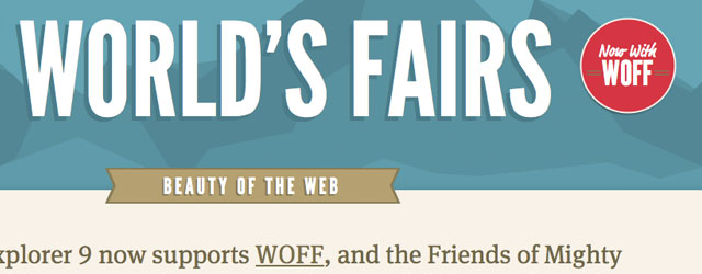
- http://www.lostworldsfairs.com/
Further Reading
- http://www.miltonbayer.com/font-face/
- http://www.webdesignerwall.com/tutorials/css3-font-face-design-guide
- http://hacks.mozilla.org/2009/06/beautiful-fonts-with-font-face/
- http://www.fontsquirrel.com/
3. One Page Web Design
It is often said that simpler is better. Some designers have taken this idea and boiled down an entire website into one page. This trend isn’t for everyone, but it’s an option to be aware of as a web designer. Take a look at the content you have to convey and see if it can be arranged in one page with interesting interactions that can engage the user. Sometimes an entire content management system (CMS) might be overkill. Like responsive web design, this is another technique that involves planning at the beginning of the project to guide the entire development process. It also involves careful consideration for navigation and user interaction.
Examples
- http://www.smartusa.com/
- http://www.janploch.de/
- http://www.carterdigital.com.au/
- http://www.onepagelove.com/
Further Reading
- http://www.noupe.com/design/single-page-websites-examples-and-good-practices.html
- http://www.sixrevisions.com/web_design/the-science-behind-a-single-page-website/
4. User Interaction with a Story
How a user interacts with your website has always been a pillar of web design. Nobody likes a site if buttons are hard to find and tasks are difficult to complete. But what if you could add more to how the user is interacting with the website? What if you add a compelling story?
People like a good story. People like to be more engaged; they want to have a two-way conversation instead of you just telling them something. Social media and it’s new role in customer service and support is a good example of this interaction.
By increasing the amount of user participation just a little bit — and keeping it simple, you can create more interaction and make the user feel more of a partner and less of a target. These types of user interaction usually involve leading the user down a path or playing a game. Again, this isn’t a technique for everybody, but it’s a popular idea to take a look at in 2012 for improving user interaction.
Examples
- http://www.head2heart.us/
- http://www.benthebodyguard.com/index.php#utmxpreview=0
- http://shape.method.ac/
Further Reading
There’s plenty more going on in web design — there’s always new coding and language developments as well as artistic design trends. I chose these four trends as the most prominent to explode in 2012 based on their momentum and their wide ranging impact on the entire design process. I would love to hear your suggestions in the comments. Are these trends boom or bust? What trend would you add to the list as number five?


