Nihon Typeface by Malwin Béla Hürkey

September 2, 2014 at 1:00 pm
Still strug­gling with the intri­ca­cies and nuances of FontLab and Opentype as I build my own font, my mind is com­plete­ly blown at see­ing over 30,000 lig­a­tures in this orna­men­tal Japonisme type fam­i­ly. I can’t wait to try a few words and see how they turn out.

1923 American Type Founders Specimen Book

August 27, 2014 at 1:00 pm

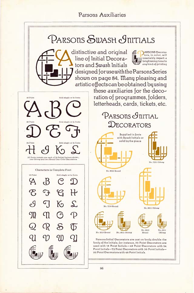
My pro­duc­tiv­i­ty and time man­age­ment for the day were just dealt a crush­ing blow. Sevanti Letterpress dig­i­tized an entire copy of the 1148-page tome that is the 1923 American Type Founders Specimen Book. Then released high-resolution PDFs of the mas­sive work for free.

Page 86 of the 1923 American Type Founders Specimen Book, Swash initial capitals with line art decoraction

So much type. So many great lay­outs and exam­ples of type in use. So many orna­ments. So many great quotes. So hard to pick pieces to high­light. Just check out the whole thing.

After all is said and done, the print­er’s work is judged chiefly by the type faces used in it. A good type face may make poor paper and cheap inks pass­able, but the best qual­i­ties of papers and of inks are inca­pable of giv­ing even a sem­blance of qual­i­ty to print­ing exe­cut­ed with type faces of infe­ri­or designs.

- American Type Founders Specimen Book (1923)

Gridlover: Vertical Rhythm Typography

August 25, 2014 at 1:15 pm

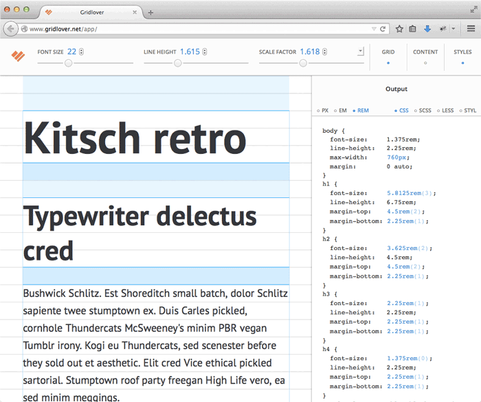
On Friday I men­tioned the Golden Typography Calculator in my redesign post. Well, sure enough, I ran across anoth­er great typog­ra­phy tool over the week­end. Gridlover is a handy web app to help you estab­lish a typo­graph­ic sys­tem with mod­u­lar scale and ver­ti­cal rhythm.

Gridlover Screenshot in Firefox, web app, typography tool, modular scale, baseline rhythm, golden ratio

Adjust the val­ues for your base font size and line-height then pick a scale — like the gold­en ratio. Gridlover then spits out the CSS, SCSS, LESS, or Stylus for font sizes, line heights and mar­gins to keep your para­graphs and head­ings on a pixel per­fect base­line grid.

Ah, two of my favorite things togeth­er — the gold­en ratio in typog­ra­phy and com­put­ers doing math for me.

Newberry Printing History

August 19, 2014 at 10:15 am

The Newberry, an inde­pen­dent research library in Chicago, is cat­a­loging and pro­cess­ing over 29,000 print­ed items that had been back­logged. Type spec­i­mens, fron­tispieces, illus­tra­tions, and adver­tise­ments from the John M. Wing Collection are see­ing the light of day and the scan­ner. The library start­ed a tum­blr to help expose the work to the world.

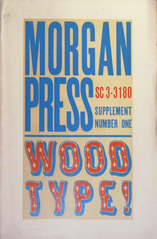
One of my favorites so far is this wavy wood type spec­i­men sheet from the Morgan Press.

Newberry Printing History, Morgan Press Type Specimen, Wavy Wood Type, Supplement Number One, press sheet

(via @okaytype)

Lego Lettering by Alice Lee

July 17, 2014 at 10:47 pm

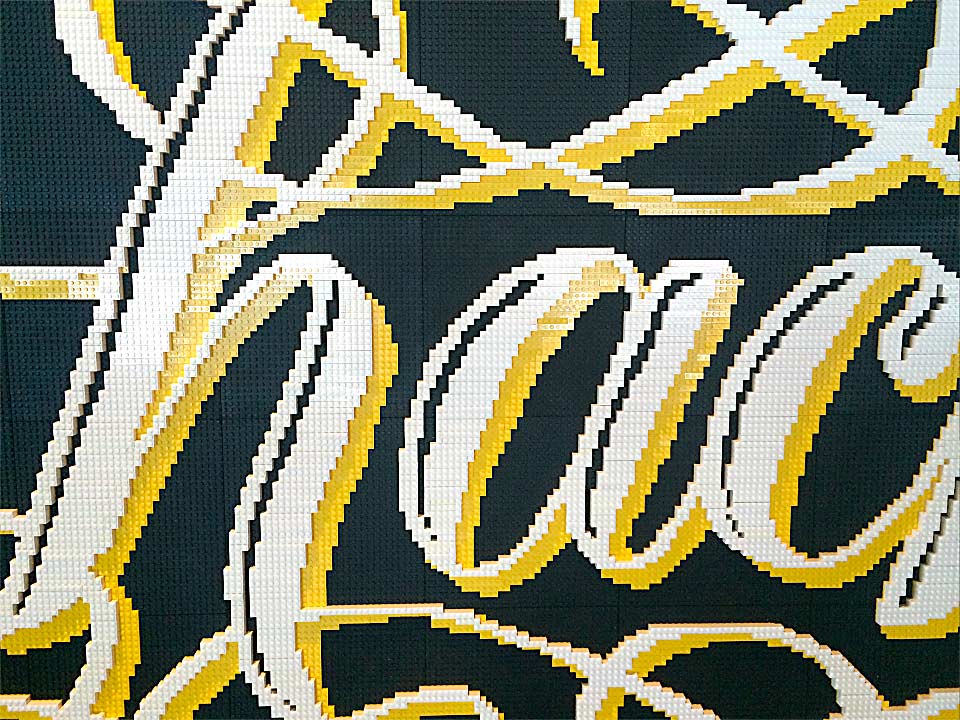
As a kid who always had Lego sets on my Christmas list — and imme­di­ate­ly put them togeth­er first thing Christmas morn­ing — this “hack” absolute­ly made my day. There’s also a fun time lapse of the construction.

Lego Lettering by Alice Lee, hack, flourishes

Headline Heads Up — No. 17

September 26, 2012 at 10:39 pm

One Tues­day every month, I’m going to round up a cou­ple (maybe a few) awe­some dis­play type­faces to show­case and give a lit­tle break­down on each one. If you have a sug­ges­tion you want me to take a look at, drop me a line. Let’s jump straight into some head­line goodness.

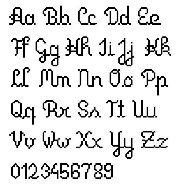
Primus Script

Foundry : Katharina Putick
Designer(s) : Katharina Putick
Cost: FREE

Primus Script Alphabet - Typeface by Katharina Putick, Pixel Script Font

Continue read­ing

Headline Heads Up — No. 11

January 10, 2012 at 10:31 pm

One Tues­day every month, I’m going to round up a cou­ple (maybe a few) awe­some dis­play type­faces to show­case and give a lit­tle break­down on each one. If you have a sug­ges­tion you want me to take a look at, drop me a line. Let’s jump straight into some head­line goodness.

Bready

Foundry : Måns Grebäck
Designer(s) : Måns Grebäck
Cost: $5 — $79 (depending on license)

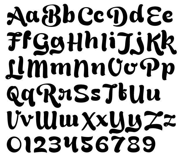
Bready Typeface Alphabet Example by Måns Grebäck - Brush Script, Lettering Alternates

Continue read­ing

Headline Heads Up — No. 10

November 9, 2011 at 8:14 pm

One Tues­day every month, I’m going to round up a cou­ple (maybe a few) awe­some dis­play type­faces to show­case and give a lit­tle break­down on each one. If you have a sug­ges­tion you want me to take a look at, drop me a line. Let’s jump straight into some head­line goodness.

GRN Burgy

Foundry : Marco Goran Romano
Designer(s) : Marco Goran Romano
Cost: FREE

GRN Burgy Alphabet Example - Bubble Letters with Reflection Highlights, Early American Graffiti and Fast Food Culture Inspiration

Continue read­ing