Along with upgrading to WordPress 4.0 today, the latest version of Yoast’s Google Analytics plugin was released with support for Universal tracking. With everything updated and squared away, I took a look at some of the numbers and decided to share. Click on any chart for a larger, easier to read version.
The Last Month Year over Year
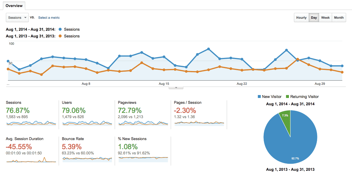
My first snapshot was a quick look at August 1st — 31st of 2014 and compare that to 2013. Over the last month, I’ve launched a redesign and been giving my site more attention as part of my move to freelancing and being my own boss. With 79% more people coming to my site, I feel great about the growth.
But What Content Are They Reading?
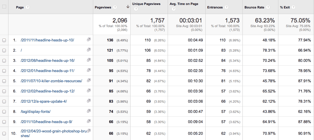
Well, their not reading the new stuff. Darn. My most popular content for the month of August 2014 is older list-style posts that showcase typefaces. These image heavy posts rank well in Google Image search for a wide range of typographical search terms. The homepage does make a strong showing at number two; a freebie rounds out the top ten. Next question, does August fit in with what people have been looking at on SpareType this year? The next table is top pages from January 1st, 2014 — August 31st, 2014.
Yep, the trend continues. The images are driving a bulk of search traffic for single page views. Readers then bounce on outbound links to where they can buy the fonts. It’s also good to see my freebie resources in the top ten views for the year. Combined they’ve been downloaded 491 times.
Year to Date
To finish up this little peek at the numbers, I decided to look at January 1st, 2014 — August 31st, 2014 and compare it to that same time period last year.
Again, improvement with more new users visiting the site. Pages per session and session duration aren’t great though. It would be nice if people stuck around and checked the site out a bit. I guess that’s what every website owner would like though.
My takeaway from glancing at the numbers is to keep making content. I need to release more design resources. I need to keep publishing posts and building value. People are reading — or at least looking — at my website. I’m not shouting into empty space. That’s a good feeling.
What do you think?
Are these numbers bad / good / meh? Am I reading them upside down or interpreting them wrong? Is there a metric you’re curious about that I didn’t cover? I’d love to hear from all 1479 users who stopped by SpareType last month.


