Say WHAT!!! — Three OS X El Capitan Things

October 15, 2015 at 10:05 pm

I’ve been run­ning the new 10.11 for a cou­ple of weeks and have been lov­ing it. Performance seems a touch faster and bet­ter even on my ancient work­horse of a Late-2008 Macbook Pro. I’ve def­i­nite­ly noticed it run­ning cool­er and spin­ning up the fans less often. But three things have real­ly stood out to me that were notable and worth remark.

  1. Flat Beach Ball of Death
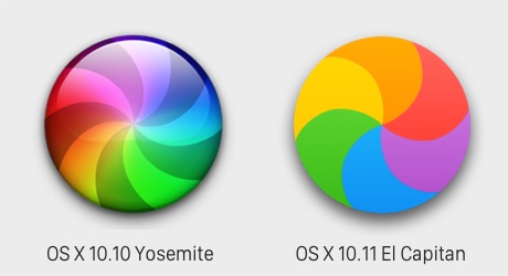
    The flat­ten­ing of design con­tin­ues and not even the rain­bow pin­wheel is immune from the trend. Not that crazy, maybe mild­ly interesting.
    Rainbow Beach Ball for Mac OS X Yosemite and El Capitan, flat design
  2. Retractable Menu Bar
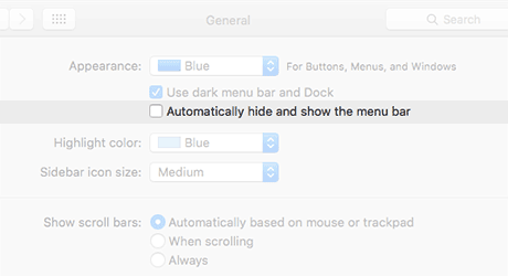
    How long has the menu bar been a sacred cow of the Mac inter­face? And now this lit­tle check box. Now that’s crazy.
    Mac OS X 10.11 General Settings Screen - Automatically hide and show the menu bar, user interface, UI
  3. Secure Empty Trash
    Apparently this was­n’t work­ing right so the solu­tion, remove the fea­ture. Say what?!?

Wireframe.cc

July 22, 2014 at 7:15 pm

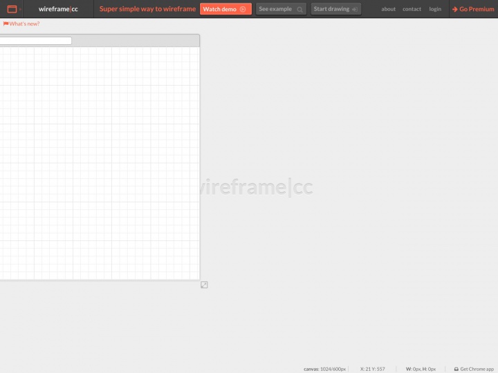
I played around with a rather nice wire-framing tool today. Wireframe.cc takes a min­i­mal­ist approach to its inter­face and user inter­ac­tion. Simple ele­ments and a lim­it­ed color palette keep your wire frames clean and allow faster iter­a­tion. You can lay­out brows­er, tablet, and mobile screens. Easily share your wire frame with a gen­er­at­ed URL, or book­mark it to come back and edit later. And all that for free.

I like that it adds just enough pol­ish over my hand scrib­bled mock­ups but is still fast and easy to work with.

Wireframe.cc Screenshot - minimalist mobile, tablet, and browser wireframing app