Well, I’m a month and half into the new year of 2011 and I’ve really fell behind. I think I’m going to slap a beta sticker on this thing, go public with it, and maybe that will force me to stay serious. There’s just so much styling and customizing that I need to keep working on to get things to the point I want them to be. Anyway, enough with the bitching — let’s get to some actual content!
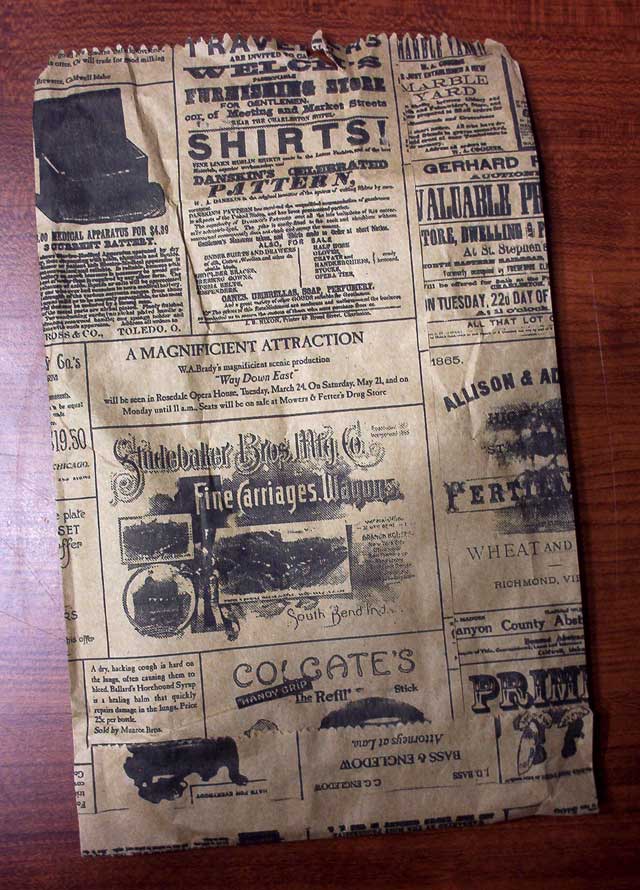
I got my girlfriend some jewelry for Valentine’s Day and it came wrapped in a surprising bag that was pretty nice. The paper was cheap kraft and the printing was cheap and bled a lot but I’m pretty sure that’s the point to achieve the look. It has a lot of charm though and definitely fits their vintage brand.
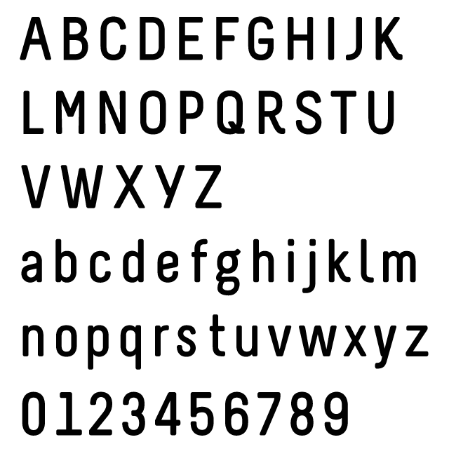
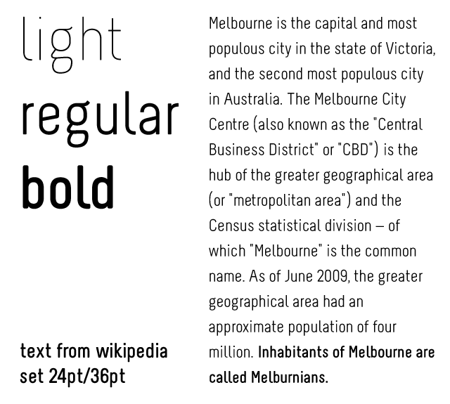
I’ve had this font around for a month or two. Not sure where I saw it first. The rounded edges really show out nice in the bold weight. At least that’s were I think it shines. It could do double duty as either body copy of carry a headline because of the bit of character that shines through in places like the lowercase “g” and the legs on the “K” and “R”
Melbourne
Foundry : 26 +
Designer(s) : John Marco Mueller
Cost: Free under CC BY-NC-ND 3.0
While I was on the 26+ website, I checked out some of the other fonts on there and found this one.
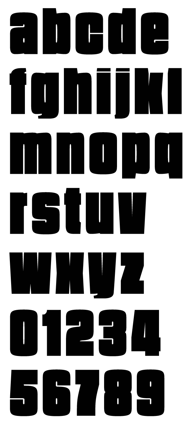
Say it Fat
Foundry : 26 +
Designer(s) : Timo Titzmann
Cost: Free under CC BY-ND 3.0
Definitely headline material here. I’ve set it below at 225 points so those counters can really shine. I also really love the numerals. It only comes in lowercase so take the into consideration. Check out the PDF specimen over at 26+
Wow, that took up a lot space. You should be rewarded for all the scrolling and for making it this far through the post. How about some cute space icons? I had the idea of something used in a children’s book with some cartoon styling of very simple shapes and flat colors. This will be release version number 0.5 because I definitely want to add to it a couple more ideas — an alien, a satellite, a telescope — so not finished yet. I also want to try and package them up as actual icons but I’ve never done that process before. Anyway, here’s a taste, so give me some feedback in the comments.
Download the package with Adobe Illustrator and EPS files.
To do list for 2011!!!
- Launch this blasted website!
- Stick to a regular posting schedule — content, content, content!
- Learn more Fontlab and try to put together my first font!
Let’s see how this goes; wish me luck!


