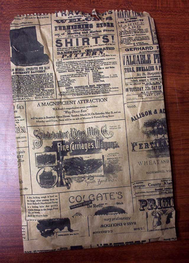
Whether you are currently a member of the living dead or just a fan of gruesome, bloody brain matter, the zombie look definitely has some awesome design elements for any horror project inspiration. Below you’ll find ten great pieces for that next gory, splattered-filled project.
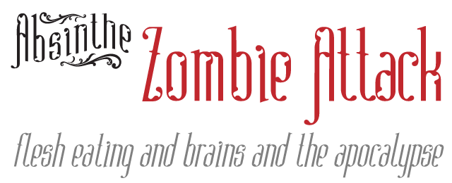
1. Absinthe Typeface
Victorian personality oozes through the curls and broken shapes of this typeface. It lends a refined gruesome, a restlessness that is uncomfortable because of the unevenness of the shapes. Absinthe is perfectly unsettling for that horror atmosphere. It also has an awesome name.
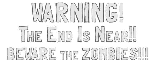
2. Folk Typeface — Sketches Variant
Again, unevenness is at play in Folk Sketches to put it on the list. Its simple letterforms make a warning message easy to read, but lend a bit of the hand scrawled nature expected in a post-apocalyptic zombie world.
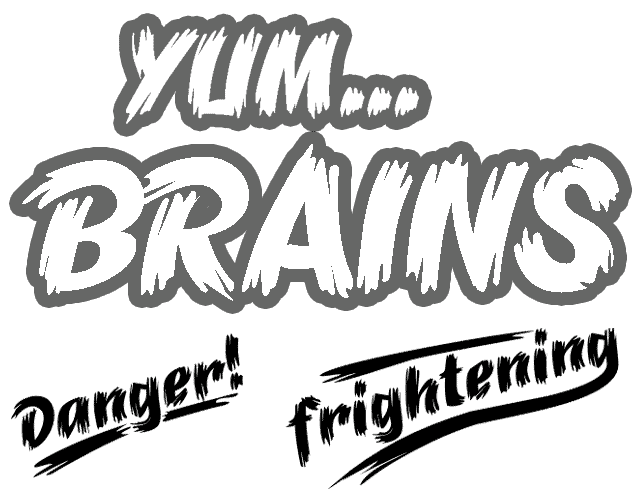
3. B‑Movie Retro Typeface
The last typeface on the list is a true a poster child. The most awesome version is Brush Extreme with its crazy edges and rough strokes. It’s a straight up monster movie or Halloween design staple. Also cool, a catchwords font of already setup words like Danger! and Terror!
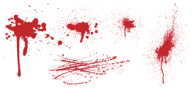
4. Blood Splatter 1
What’s more zombie than blood splatter? I can’t think of anything else. You’ll always need a few good blood splatter patterns to add background texture and help set the scene of gruesome.
