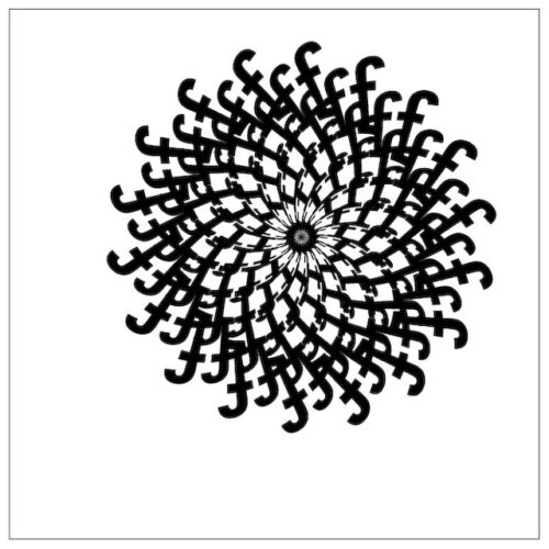
I was helping someone understand type on a path and how to arch, warp, & bend text when I thought of this really cool idea. The following tutorial will show you how to build interesting spiral shapes with a simple string of letters using Adobe Illustrator and the Warp Effect Arc.

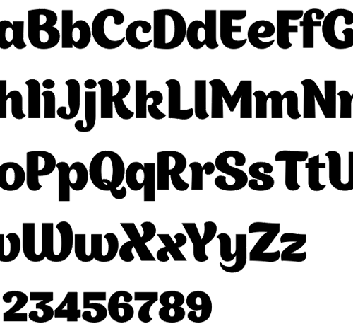
This month’s headline-grabbing display fonts include a free set of pixel fonts and two upright scripts that are on opposite ends of the weight spectrum. Oh, and one of them is by Laura Worthington so you know it’s going to be good.

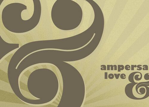
It’s amazing how much personality Gill Sans has in the Ultra Bold. There’s some of that in this wallpaper along with a interesting ampersand with an even more interesting story behind it. *Hint: There be pirates in these waters!*

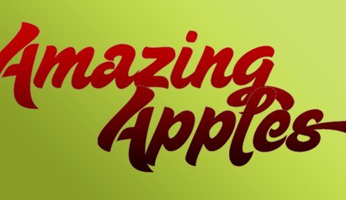
This month’s showcase of display fonts has Victorian drop caps, Art Deco craziness, and both a brush script and a formal script. The formal script is quite a piece with five styles for building up headlines by layering and offsetting lines of type.
Some people at work suggested zombies the other day when I asked for more ideas about the next round of buttons I was making. After digging into it a bit, I put together a post of 10 killer design resources for the horror/zombie atmosphere. Now to bring the zombie apocalypse to your desktop wallpaper!
Whether you are currently a member of the living dead or just a fan of gruesome, bloody brain matter, the zombie look definitely has some awesome design elements for any horror project inspiration. Below you’ll find ten great pieces for that next gory, splattered-filled project.
One Tuesday every month, I’m going to round up a couple (maybe a few) awesome display typefaces to showcase. This month — a heavy weight monolith called Codswallop, a gravure of a question, and a deal to good to pass up.
I’ve been playing Angry Birds like crazy recently and when it came time to sit down and make a wallpaper for this month’s post I immediately thought of doing something birdy.
