This Week’s Tabs [Expanded Holiday Edition]

January 23, 2015 at 8:44 pm

It never fails that my post­ing fre­quen­cy drops around Christmas and New Years. I seem to fall into a win­ter hiber­na­tion or maybe it’s a food coma. Whatever it is, I’m shak­ing it off and unload­ing all the cool links I’ve been sav­ing up.

Chris Allen has an awe­some­ly sim­ple port­fo­lio site full of nice work.

I loved land­ing on Benjy Stanton’s site because you get a bit of his per­son­al­i­ty right off the bat.

Ivo Mynttinen has a gor­geous hero image and well-designed site over­all. I also love the trans­paren­cy he took with his business.

Build your own over­head desk image with this free­bie of Designer Desk Essentials from Graphic Burger.

I love the details in this free­bie of food themed icons.

And speak­ing of food, “C” is for cook­ie. “L” is for letter-pressed.

Speaking of free­bies, Freebbble lets you search Dribbble resources by license so you can find free for com­mer­cial use design items.

These off-canvas menu effects would add a nice touch to your user experience.

Do you won­der how some­body else solved that tricky design prob­lem you’ve been hav­ing with a dia­log box, login form, or other ele­ment. Well, Codepen put togeth­er a library of design pat­terns for you to draw inspiration.

There’s also this list of user inter­face ideas to check out.

Kenneth Cachia put togeth­er this SVG-based seam­less pat­tern maker in your browser.

Quickly and eas­i­ly build an ani­mat­ed CSS gra­di­ent with this tool by Ian Forrest.

The Lost Type crew share a few of their favorite draw­ing tools.

New tech meets old tech in Richard Ardagh’s idea of a 3D-printed let­ter­press font.

Speaking of new tech, Gyroscope har­ness­es your social media activ­i­ty and health data to build a web­site about your life.

Motive — Digging the design of this WordPress theme by ThemeZilla

I also like this free theme from Automattic — Goran

More WordPress — eas­i­ly add employee/team pro­files with this Staffer plu­g­in.

I’m always check­ing out the CMS, website-building land­scape so this list was super help­ful in find­ing new contenders.

I’m get­ting one of these t‑shirts for my birth­day because my wife loves me.

Mmmm… Typography poster… So nice…

Aerial Wallpapers — inter­est­ing satel­lite imagery opti­mized for use as iPhone 6 Plus wallpapers

I’ve always want­ed to get into using Gantt charts to get orga­nized. Maybe I’ll give this free tool from Twproject a shot.

Great sug­ges­tions about what could be slow­ing down your team and how to fix them. Don’t Blame the Designer.

Need some sug­ges­tions for how to struc­ture and write your code? Check out Mark Otto’s Code Guide for HTML and CSS.

Is that new client or job worth tak­ing? Here are three ques­tions to help you con­sid­er the true value of every design job.

And here’s anoth­er six ques­tions to ask dur­ing inter­views to find out about a com­pa­ny’s cul­ture and environment.

Another post from the busi­ness side — Pay People for Commitment. He def­i­nite­ly has a point about the chang­ing dynam­ics of work/life balance.

An extreme­ly long read, but def­i­nite­ly worth it if you are think­ing of strik­ing out on your own. How I Wrote and Sold My First Ebook

And we’ll end this mon­stros­i­ty of a list with a video — Guardians of the Galaxy: 8 Bit Cinema
Loading the Dishwasher

January 7, 2015 at 7:38 pm

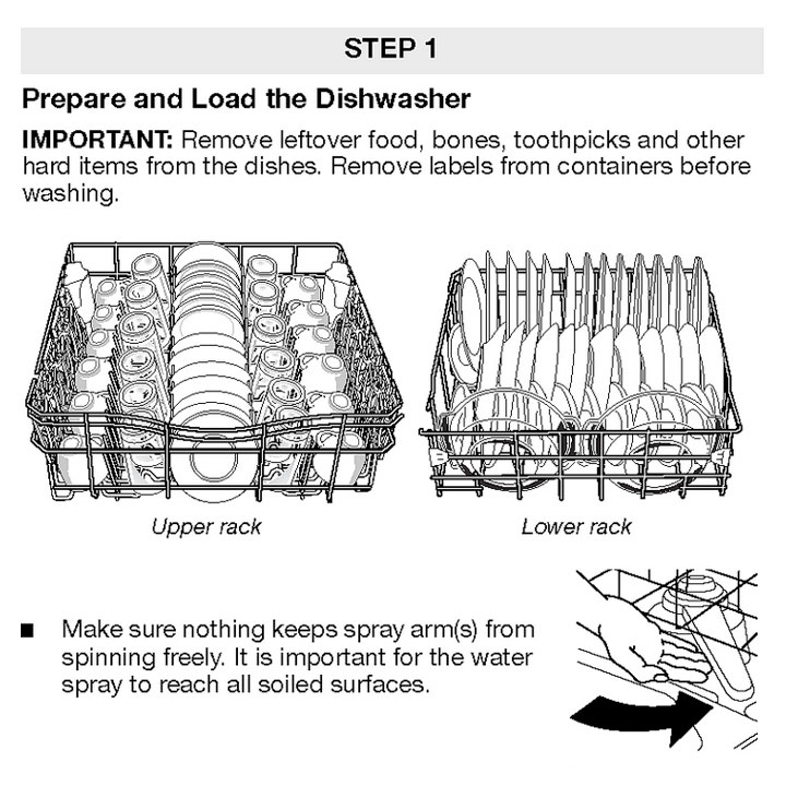
In response to a L.A. Times arti­cle, Joe Clark assem­bled a Flickr gallery of dish­wash­er instruc­tion man­u­als. I thought this was inter­est­ing enough to blog because

  1. Somebody, some­where had to design these man­u­als. They made lit­tle dish­wash­er illus­tra­tions or took pic­tures of a “prop­er­ly” loaded dish­wash­er. That’s funny to me.
  2. I have per­son­al­ly been scold­ed many a time for my inef­fi­cient, unortho­dox, and just plain wrong load­ing of a dishwasher.

Dishwasher Loading Manual, upper rack, lower rack, plates, cups, saucers

(via Kottke)

UX Kits — Deck of Cards

December 17, 2014 at 7:54 pm

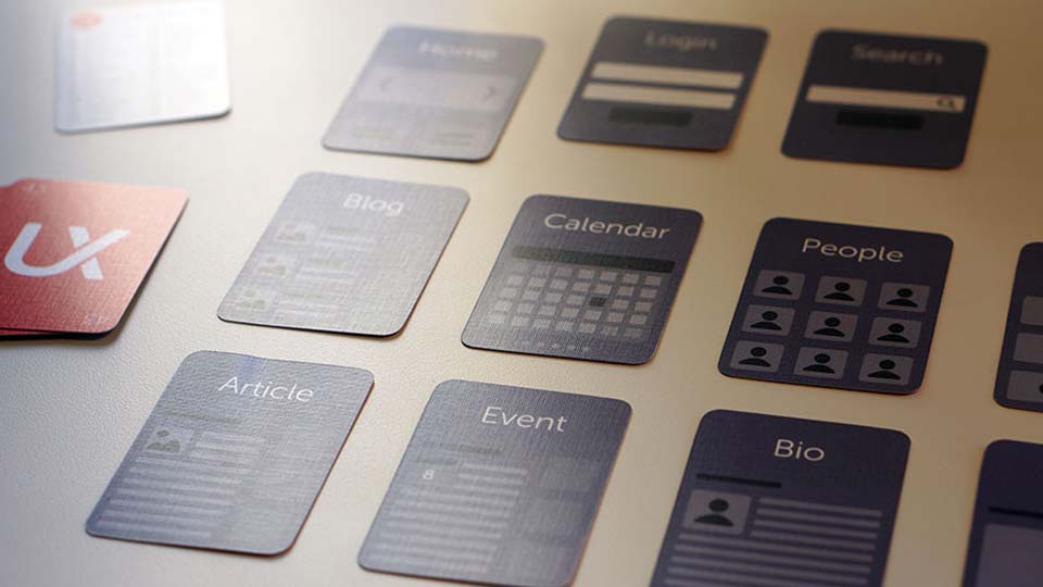
Looking for a last minute stock­ing stuffer for that web­site design­er in your life? Maybe you need some­thing to throw in the pile for the agen­cy’s Dirty Santa game? Have a look at this deck of 53 minia­ture play­ing cards for lay­ing out your infor­ma­tion archi­tec­ture and mak­ing con­tent dis­cov­ery more fun. Well designed, nerdy, and func­tion­al - awe­some!

UX Kits Deck of Cards for Information Architecture, Site Mapping, Wireframing, Content Discovery, website components

On Pixel Perfection

November 24, 2014 at 2:34 pm

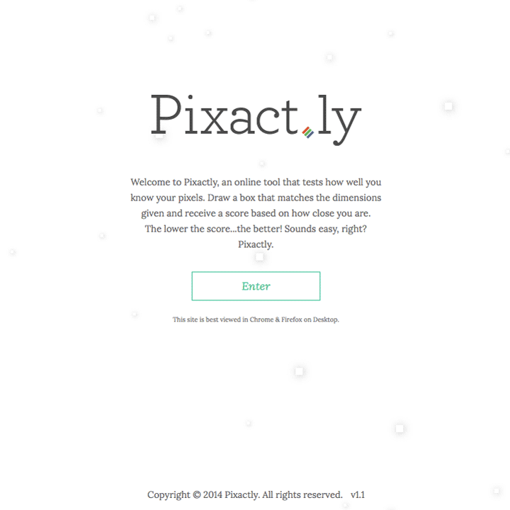
So I’ve got two great links deal­ing with pix­els to kick off the week. First up is Pixact.ly — a game for test­ing how well you know your dimen­sions. Given a width and height, how pre­cise can you draw the box?

Pixact.ly Screenshot - Pixel Measuring Game, browser game, pixel, dimensions

Second is The Dead Pixel Society. A group of 1990s-era icon design­ers have reunit­ed to tri­umph the 32×32 pixel can­vas of their youth. Each icon is hand­craft­ed pixel by pixel with the same lim­it­ed, 256-color palette of yes­ter­year. It real­ly takes a video to stress the atten­tion to detail and insane amount of rework­ing it takes to get to a fin­ished product.

As far as my favorite, Benny from The Lego Movie is pret­ty hilar­i­ous. But that might be influ­enced by the fact that I final­ly watched the movie yesterday.

Portent’s Content Idea Generator

November 13, 2014 at 2:00 pm

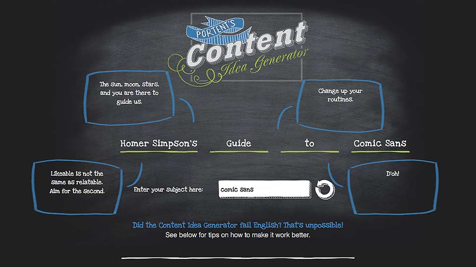
The folks over at Portent have a humor­ous take on get­ting past writer’s block. Their Content Idea Generator lets you put in a key­word or sub­ject and then spits out a very Buzzfeed-esque title as a writ­ing prompt. There’s a great mix of hilar­i­ous, absurd, bad, serendip­i­tous, and/or genius ideas for writ­ing a blog post.

Here are a few of the best I got back this morning.

19 Things About Typefaces Your Kids Don’t Want You to Know

Darth Vader’s Guide to Typefaces

How to Be Unpopular in the Typography World

5 Ways Comic Sans Could Help the Cubs Win the World Series

Why Comic Sans is Hotter than Jennifer Lawrence

Portent's Content Idea Generator Screenshot - chalkboard background, comic sans keyword, homer simpson reference, article title, writing prompt, search engine optimized headline

Job Title: Brick or Mortar

October 14, 2014 at 12:11 pm

Excellent post yes­ter­day from Brad Frost about job titles. I need­ed some of this lan­guage the other week when I was talk­ing about what I do and what my strengths are. I got my point across, but this metaphor would have made things so much eas­i­er to understand.

But while it’s pos­si­ble to build walls only using bricks, they’re not going to be as sta­ble as they should be.

A corol­lary to Brad’s idea is that you can’t have all mor­tar. Everybody in the com­pa­ny can’t be super flex­i­ble and fit in wher­ev­er. The mor­tar has to have some bricks to work with. Otherwise you just have a big, wet pile of dirt for a business.

I am def­i­nite­ly a mor­tar per­son. I fill in the gaps and coor­di­nate among all the bricks. The tricky part is bal­anc­ing the amount of coor­di­na­tion with get­ting actu­al work done. You can’t be just an inter­me­di­ary; you still have to pro­duce some­thing at the end of the day.

I Love Mike Monteiro and You Should Too

October 6, 2014 at 2:49 pm

It was hard not to quote this entire excerpt from Mike Monteiro’s new book, You’re My Favorite Client. I nar­rowed it down to two, but you should go read the whole excerpt. Then you should read it a sec­ond time like I did. It’s that good. I’m cur­rent­ly debat­ing how many copies to buy because I feel this should be required read­ing for every design­er or busi­ness leader I meet.

When a col­league runs into your office and says, “The design­er is chang­ing things!” a well-placed “That’s exact­ly what I’m pay­ing the design­er to do” sets the per­fect tone.

Amen! Halleluiah! Can I get a what-what? Change is hard for a lot of peo­ple, but often nec­es­sary to keep mak­ing progress. Shoot, just stay­ing cur­rent and on par these days requires a healthy amount of change and flex­i­bil­i­ty. Designers are adept at mak­ing changes because of our prob­lem solv­ing skills. Given the right author­i­ty and sup­port, we can make ground­break­ing con­tri­bu­tions to a business.

A design­er with back­bone and expe­ri­ence won’t have any prob­lem carv­ing out the room they need to work, but they can’t do so if you don’t grant them the author­i­ty. Otherwise, you run the risk of bring­ing some­one in to fol­low the whims of those around them. That’s not a full mem­ber of the team. That’s a glo­ri­fied Xerox machine, an asset used by the rest of the com­pa­ny when­ev­er they need some pix­els pushed around.

That’s how some­one who’s sup­posed to work on your website’s UI ends up mak­ing Lost Cat fly­ers for Betty in HR.

And the sec­ond rea­son I love Mike Monteiro is because of this 2011 Creative Mornings talk titled F*ck You. Pay Me. Again, required watch­ing for any­body in the free­lance busi­ness. I can’t tell you how many times I’ve watched it just as a lit­tle pick me up, morale boost.

And if a third is required, the guy has a pret­ty sweet beard.

The Return of Homestar Runner

October 4, 2014 at 10:05 pm

Some of my first expe­ri­ences of “the Internet” were Homestar Runner car­toons. They were ridicu­lous and funny and witty. And they might be back. After a three year hia­tus, an April Fool’s car­toon was post­ed ear­li­er this year. Now anoth­er new car­toon has been released for our view­ing plea­sure. In true Homestar fash­ion, the return is a bizarre hip-hop jam about fish-eye lens­es. Bulbous!

Homestar Runner Fish-Eye Lens Hip Hop Video Still, Coach Z Bulbous Butt Shot