This Week’s Tabs

July 8, 2013 at 9:03 pm

Adrift from Simon Christen on Vimeo.

A day in the life of a type design­er — a lit­tle to the left, a lit­tle to the right

Ready to Inspire Conference — design, type, code (also check out last year’s videos)

Pen and ink let­ter­ing — qual­i­ty, robust, serendip­i­ty, tactile

screensiz.es — great ref­er­ence for width, height, den­si­ty, and aspect ratio

430+ FREE sto­ry­board illus­tra­tions — Not for com­mer­cial use, but still a great inspi­ra­tion for sketching

Adam Whitcroft — check out the cou­ple of projects he has released

colourco.de — an awe­some way to build color palettes

Designers Like to Complain — love the tum­blr theme

The Secret Handshake — help­ful, inspi­ra­tional tips for cre­ative individuals

This Week’s Tabs

May 23, 2013 at 11:05 pm

I’ve seri­ous­ly got too many tabs open of things I want to share. So here is a quick list of cool, insight­ful, and/or fun things to check out.

Subtle Patterns Photoshop Plugin — (the robot siren is awe­some, too)

Designing Blogs for Readers — a great reminder for focus­ing on content

Do you real­ly need a free­lance port­fo­lio? — a great reminder for focus­ing on clients

Stacked Font by Denise Chandler — land­ing page extraordinaire

Ductus by Thomas Jockin — this is going to show up on next mon­th’s head­line heads up

100 Pixelated Camera Illustrations — some are a lit­tle blob­by, but there are some real gems

David Bushell’s opin­ion on design­ing in the brows­er vs mockups

BitTorrent Sync — def­i­nite­ly going to find some­thing to imple­ment this

Starters Guide to iOS Design — a well designed overview of what to look for­ward to

Better Search Engines for Designers

April 17, 2013 at 6:46 pm

If your tired of using Google Image Search to find design inspi­ra­tion and free­bie resources, then you need to check out these two new search engines. They’re bet­ter designed and curat­ed to pro­vide design pro­fes­sion­als with bet­ter results.

For free­bies, psddd.co combs through Dribbble and orga­nizes items that have been released into the wild for the design com­mu­ni­ty to use. Things are added and cat­e­go­rized man­u­al­ly to main­tain a high qual­i­ty of search results. There’s already over 780 items cat­e­go­rized and search­able bet­ter than what is cur­rent­ly offered on Dribbble itself. The design of Psddd also puts more focus on resources as any good search engine should.

Psddd Screenshot - Free design resources search engine, image search, graphic design freebies


For inspi­ra­tion, niice.co scrapes Behance, Dribbble and Designspiration and presents results in a large grid lay­out that makes them easy to quick­ly digest and get cre­ative juices flow­ing. Each photo links to its orig­i­nal post to get more infor­ma­tion if some­thing real­ly stands out to you. In the future, they plan to add more source mate­r­i­al sites as well as share­able boards to col­lect inspiration.

Niice Screenshot - Design inspiration search engine, image search, design resources

Responsive Web Design Sketch Paper

January 17, 2012 at 11:32 pm

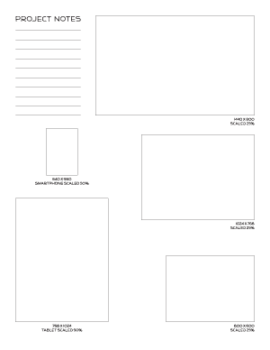
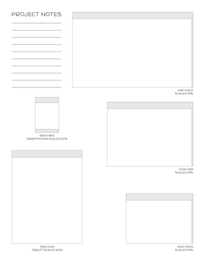
Responsive Web Design Sketch Paper Blank - Wire-framing, Design sketching, Layout drawingResponsive Web Design Sketch Paper Interface - Wire-framing, Design sketching, Layout drawingI sat down today to start sketch­ing some ideas for a respon­sive web site design. Imagine my sur­prise when I searched for a sim­ple, letter-sized tem­plate of win­dow sizes only to find one result. I want­ed some­thing a lit­tle dif­fer­ent, so I made my own.

These pages are for early stage wire-framing and sketch­ing since the win­dows are scaled 25% — 50% of what they will actu­al­ly become. I found it use­ful to have them all on one page so I could eas­i­ly see the dif­fer­ences in aspect ratio and size. I did­n’t spend much time sketch­ing on these pages before mov­ing to larg­er sheets with grids, but they helped me get ideas start­ed for fur­ther refine­ment in that next stage.

There are screen sizes of 1440 x 900, 1024 x 768, and 800 x 600 scaled down to 25%. Then there is a smart­phone and tablet size (based on the res­o­lu­tions of the iPhone4S and iPad2) scaled to 50%. There is one PDF with blank out­lines and a sec­ond PDF with gener­ic scroll bar and head­ers blocked in for consideration.

Let me know if you find them as help­ful as I did in the comments.

What you need to know about Web Design in 2012

January 3, 2012 at 9:22 pm

As every year comes to an end, reflec­tion and antic­i­pa­tion come togeth­er. If you have a part in the ever chang­ing world of web design, you might start to won­der, “Are my web­sites miss­ing some trick or trend, some tech­nique that would make them just a lit­tle bit bet­ter?” I wan­dered the web a lit­tle bit and came up with the fol­low­ing list of four web design trends that need to be on your radar for 2012. If you are already doing these things — you are an awe­some web design­er, keep up the great work! If you’ve never heard of it — take a look at each fur­ther read­ing sec­tion and make your­self a smarter, bet­ter web design­er for 2012.

1. Responsive Web Design

2012 Web Design Trend - Responsive Design for Various Devices - Laptops, Smartphones, Televisions

The hot topic issue of 2011 was respon­sive web design. Using CSS3 media queries, lay­outs and con­tent can adjust based on width, height, device ori­en­ta­tion, and more. Continue read­ing

10 Killer Zombie Resources

July 4, 2011 at 5:42 pm

Whether you are cur­rent­ly a mem­ber of the liv­ing dead or just a fan of grue­some, bloody brain mat­ter, the zom­bie look def­i­nite­ly has some awe­some design ele­ments for any hor­ror project inspi­ra­tion. Below you’ll find ten great pieces for that next gory, splattered-filled project.

1. Absinthe Typeface

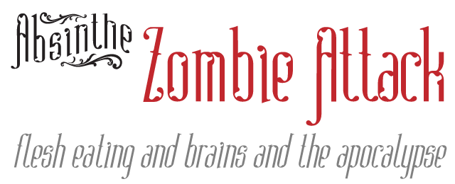
Victorian per­son­al­i­ty oozes through the curls and bro­ken shapes of this type­face. It lends a refined grue­some, a rest­less­ness that is uncom­fort­able because of the uneven­ness of the shapes. Absinthe is per­fect­ly unset­tling for that hor­ror atmos­phere. It also has an awe­some name.
Absinthe Typeface used in a Zombie Attack

2. Folk Typeface — Sketches Variant

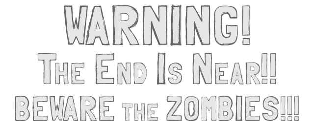
Again, uneven­ness is at play in Folk Sketches to put it on the list. Its sim­ple let­ter­forms make a warn­ing mes­sage easy to read, but lend a bit of the hand scrawled nature expect­ed in a post-apocalyptic zom­bie world.
Folk Typeface used to Warn of Impending Zombie Apocalypse

3. B‑Movie Retro Typeface

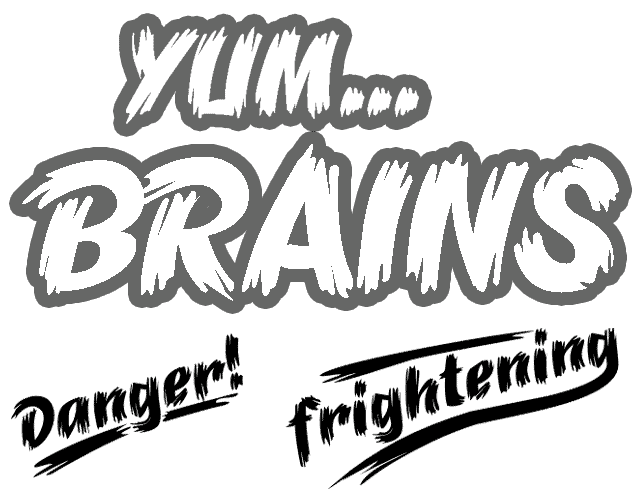
The last type­face on the list is a true a poster child. The most awe­some ver­sion is Brush Extreme with its crazy edges and rough strokes. It’s a straight up mon­ster movie or Halloween design sta­ple. Also cool, a catch­words font of already setup words like Danger! and Terror!
Yum...Brains and Danger! and frightening set in B-Movie Retro Typeface

4. Blood Splatter 1

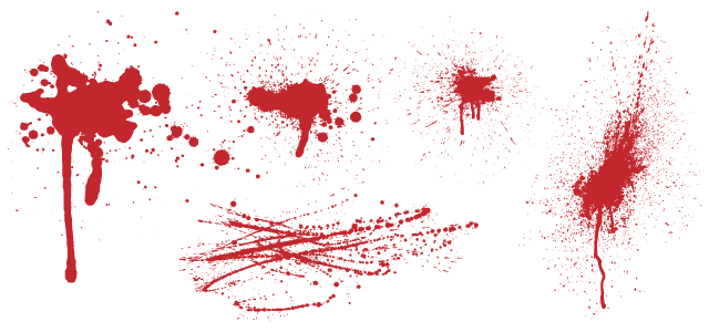
What’s more zom­bie than blood splat­ter? I can’t think of any­thing else. You’ll always need a few good blood splat­ter pat­terns to add back­ground tex­ture and help set the scene of gruesome.

Various Blood Splatter Patterns - Set 1

Continue read­ing