I’m pretty excited today because I decided to pull the trigger and launch my redesign of SpareType. With the new look now out in the wild, I wanted to talk a little more about it. This first post in a series about the redesign focuses on the visual design changes. More posts will be incoming about coding changes and process.
New Identity and Logo
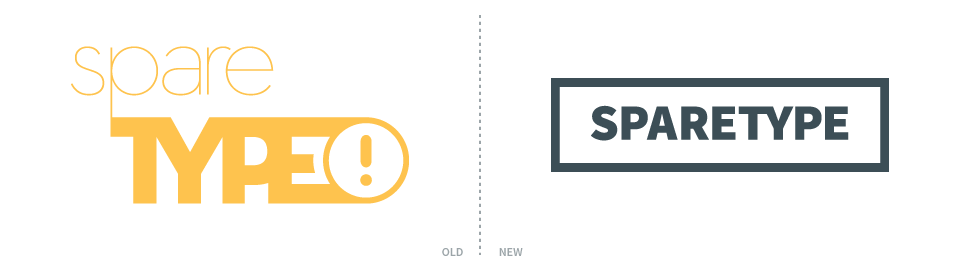
I designed the original SpareType logo in 2008 as part of my college senior project. Now that I am using the name and brand for my freelancing career, it was time for a redesign. I wanted something so clean, simple, and easy that there wasn’t even design there. There’s the one typographical nod with the ‘TY’ ligature. Everything else about the logo screams plain and uneventful.
The idea is that the content is the focus. The logo and identity are simply frames for showcasing content. Artwork, client projects, and type design all have enough personality. They don’t need a fancy identity branding them. They brand themselves. The work should also build the brand of SpareType more than the logo.
Color

Rethinking the color scheme was a big step that set a lot of progress in motion. Stepping back from the golden yellow [#FEC34D] and using it as an accent in a 60−30−10 palette helped a ton. There was lots of tweaking to settle on a 60% percent color. It needed to complement so that meant the blue family. It needed to be dark but not completely black. It should be duller so that accents popped. The winner ended up being #3C4D56. It’s a great base and doesn’t attract attention to itself. Rounding out the palette is a light grey #9CA5A9 that I haven’t used much because white has worked so well.
The Jumble
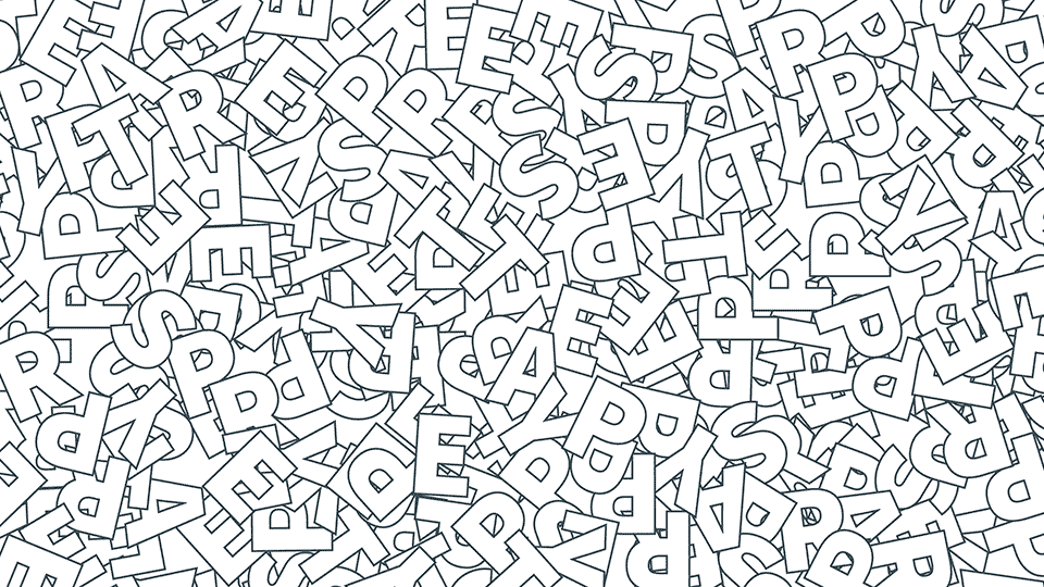
In putting together business supplies and profile headers, I did find the logo too simple and needed to add another element to the identity. I’ve always loved this typography jumble and it was the perfect element to round out the identity and provide some interest in situations that needed a little more. It’s complexity contrasts with the simplicity of the rest of the design and provides a balancing point. It isn’t on the website yet, but I’m thinking larger screen sizes might see a parallax version of the jumble on the right hand margin.
Website
The idea from the logo — a simple frame for content — guided the design of the website. All it needs to be is a simple structure for displaying work and thoughts. Focusing on the content meant perfect typography for reading and plenty of white space so images could stand out. Similar to the identity, a lot of progress happened quickly once the color palette took shape. I’ll have more on the website design in parts two and three where I’ll talk about some of the coding details and how I’m changing my process. Look for those posts later this week!


