The third and final post in the series about my recent redesign of SpareType is the fun one chock full of bits of code. With visuals and process out of the way, it’s time to dig into the pieces that actually make the site run. This isn’t going to be a comprehensive breakdown of every line of code but a look at my favorite pieces that do the most heavy lifting.
Typography
Font sizes and line-height are the perfect candidates for variables in a CSS preprocessor. I’m running Sass because that’s the one I heard of first and it was easy enough to pick up the basics of imports and variables.
// =Variables for typography expressed in pixels
$title-text: 58;
$headline-text: 36;
$subhead-text: 28;
$primary-text: 22;
$secondary-text: 17;
$title-leading: 60;
$headline-leading: 44;
$primary-leading: 36;
$secondary-leading: 27;
So where did these numbers come from? The Golden Ratio Typography Calculator, of course. This provides a reliable scale and hierarchy while also addressing readability with an appropriate character per line count (CPL). While being responsive will cause that number to fluctuate, I’ve designed for 65 CPL on desktop sized screens which make up the bulk of my traffic. So what do we do with these numbers? Say hello to the only mixin in my Sass so far.
// =Font size and line height mixin for pixels and rems
@mixin font-size($fontsize: $primary-text, $lineheight: $primary-leading) {
font-size: $fontsize + px;
font-size: ($fontsize / 16) + rem;
line-height: $lineheight + px ;
line-height: ($lineheight /16) + rem ;
}
This beauty allows you to pass it one of the variables above then spit it out in pixels for older browsers and rem units for newer browsers. The ‘16’ comes from the default type size in pixels. This piece is awesome because it does all the math in converting pixels to rem units. Hooray, for computers doing math. Now, the mixin in action.
body {
    @include font-size($primary-text,$primary-leading);
    color: $brand-color1;
    font-family: 'Source Sans Pro', sans-serif;
}
h1 {
    @include font-size($title-text,$title-leading);
}
h2 {
    @include font-size($headline-text,$headline-leading);
}
@include calls the mixin named font-size. The variables for text size and line-height are included for that particular element. Then we have some other CSS rules to start the overall styling of the text with color and font-family. The color property also shows off another perfect use of variables for defining color palettes to be reused throughout the code. Once compiled from Sass to normal CSS it looks like the following.
body {
font-size:22px;
font-size:1.375rem;
line-height:36px;
line-height:2.25rem;
color:#3c4d56;
font-family:'Source Sans Pro', sans-serif
}
h1 {
font-size:58px;
font-size:3.625rem;
line-height:60px;
line-height:3.75rem;
}
h2 {
font-size:36px;
font-size:2.25rem;
line-height:44px;
line-height:2.75rem;
}
Layout
My favorite piece of structure for the site is the blog page with its tiles for each blog post. Amazingly, it’s a CSS only solution. The secret is inline-block and column-count, which has plenty of browser support when prefixed. Set the column-count and column-gap on a div that wraps the articles. Then set the articles to inline-block and 100% width.
.loop-content {
    margin: 184px 72px 18px;
    -moz-column-count: 1;
    -moz-column-gap: 72px;
    -webkit-column-count: 1;
    -webkit-column-gap: 72px;
    column-count: 1;
    column-gap: 72px;
}

.loop-content article {
    display: inline-block;
    margin-bottom: 72px;
    width: 100%;
    background-color: $brand-color4;
    border: 2px solid $brand-color1;
}

@media screen and (min-width: 850px) {
    .loop-content {
        -moz-column-count: 2;
        -webkit-column-count: 2;
        column-count: 2;
        max-width:800px;
    }
}
This technique works great in a responsive design because you can update the column-count on wider displays to spread out information. You can adjust the width of the wrapping div and the column widths inside will adjust accordingly. Again, hooray for leaving the math to the computer and letting the browser calculate widths. I’ve also used this technique in the footer for laying out widgets there.
Multiple Thumbnails
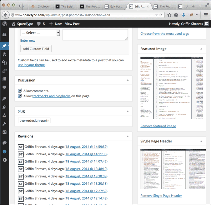
The last piece of code I’d like to highlight is WordPress specific and actually involves installing a plugin. The Multiple Post Thumbnails plugin allows you to register extra featured images for your posts. It does take some coding to get working, but that flexibility allows for lots of tweaking to fit your design goals. All the code and instructions for implementing the plugin can be found on this Github page. It dovetails perfectly into WordPress’s built-in media manager and custom image sizes registered through functions.php. Plus, there is no limit to how many featured images you can add.
Those three pieces of code really do 80% of the work around the site. They are powerful, understandable, and adjustable which makes them amazing tools for working with the site’s design. As I makes tweaks and introduce new code, I’ll be highlighting the stand out pieces here on the blog so keep an eye out for those.
For now, that wraps up the redesign series about the site. If you really want to follow along, I am doing all of this out in the open on Github. Plus, there’s always the RSS feed so you can catch all of my blog posts. Now, go code something.

