The Math Behind Bezier Curves

October 3, 2014 at 10:14 am


When mov­ing points and con­trol han­dles around in Illustrator I’m not think­ing about the math and num­bers the com­put­er is crunch­ing to cre­ate the curve I want. I’m just think­ing about what kind of curve I want. But this video is a great break­down of how things hap­pen. It’s not real­ly going to help you have bet­ter curves — there’s plen­ty of other places for that — but know­ing how your tools work is a sign of a good craftsmen.

iPhone Camera Comparison

September 23, 2014 at 4:16 pm

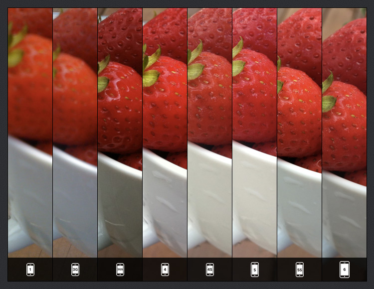
Technology gets bet­ter, faster, stronger every year. But what does that actu­al­ly look like? Lisa Bettany pulls out all eight iPhone mod­els and shoots the same shots to com­pare the progress Apple’s hard­ware and soft­ware have made over the years.

iPhone Camera Comparison by Lisa Bettany, Strawberries in a bowl close up shot with multiple iPhone camera models

(via @tomstandage)

Warioworld.com

September 19, 2014 at 1:53 pm

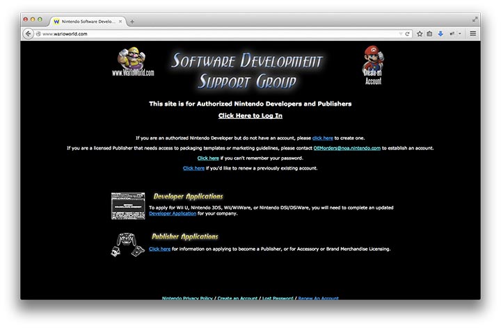
This arti­cle popped up in my RSS feed yes­ter­day and it was too much. Something welled up inside me to fight the evil design in the world in what lit­tle way that I could. I gave myself 24 hours to code a new land­ing page from scratch. (I had to give myself a good buffer because I knew noth­ing was get­ting done last night while I watched the foot­ball game. War Damn Eagle!) Along the way, I cleaned up the infor­ma­tion archi­tec­ture and rewrote some copy.

There’s way more that could be done, but I want­ed to give myself a hard dead­line. By putting myself on the clock, I did­n’t futz around. Nor am I hold­ing on to it because it’s not per­fect. It’s just an unso­licit­ed redesign of a land­ing page — noth­ing more, noth­ing less.

The cur­rent site lives at warioworld.com while you can see my redesign live on my new play­ground space.

Firefox Screenshot of Warioworld.com as it Currently Exists, 1996 web design, my eyes hurt

Warioworld.com Current Screenshot

Firefox Screenshot of Warioworld.com Redesigned Landing Page, unsolicited, responsive, web design

Warioworld.com Landing Page Redesign

Let’s Internet Like 1998

September 15, 2014 at 3:01 pm

Last Wednesday, September 10th was a call to action for sup­port­ing net neu­tral­i­ty. Lots of great com­pa­nies and peo­ple joined in spread­ing the word includ­ing yours truly.

The fun­ni­est thing to come out of this pub­lic out­cry so far is Comcastify.js by The Onion. This script cov­ers up your images and slow­ly reveals them like an old dial-up con­nec­tion. It’s witty, snarky, and spot on. It could be used for good since you can con­trol the speed and amount of reveal for each step.

Watercolor Street Maps

September 10, 2014 at 4:44 pm

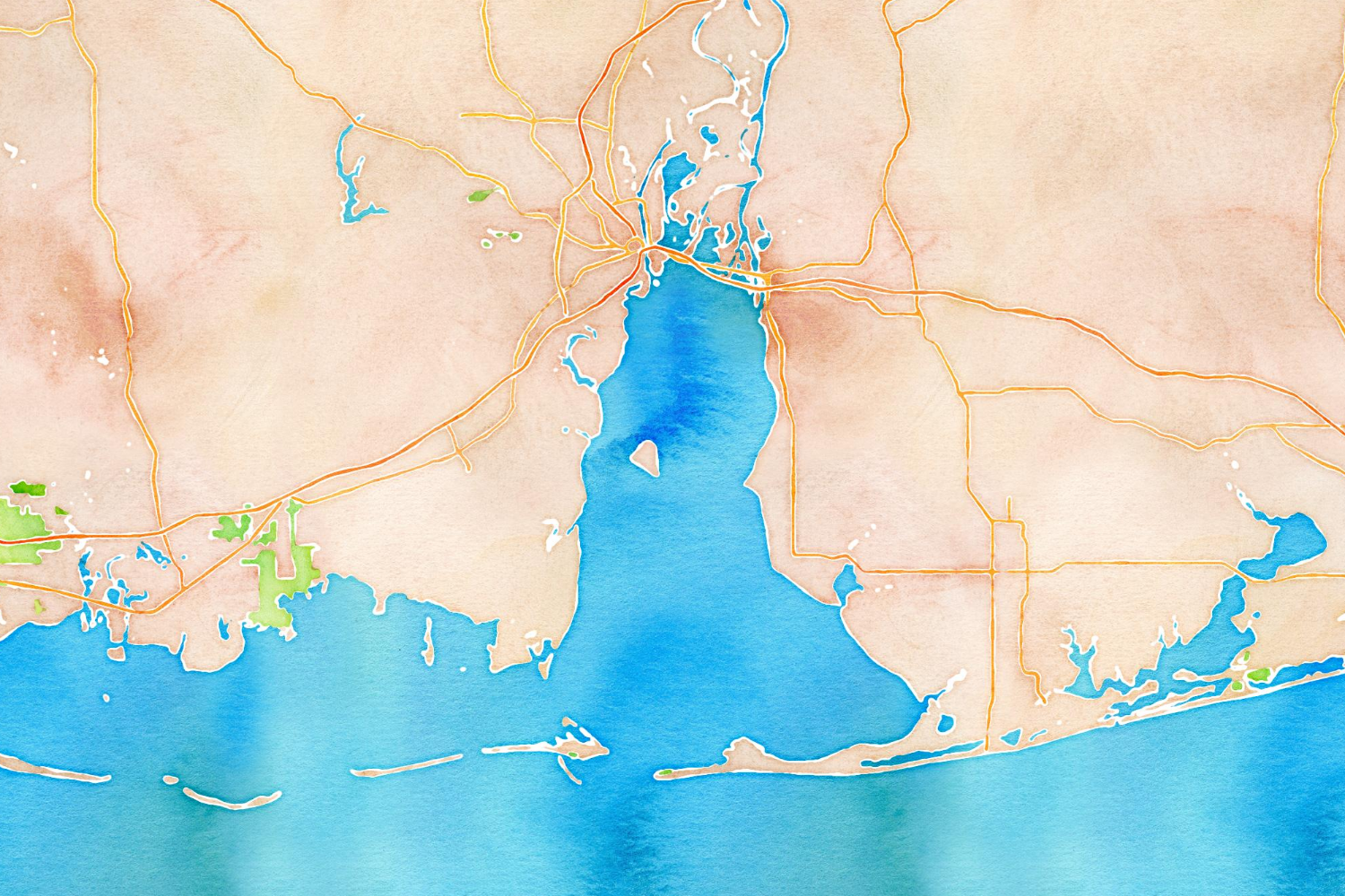
Using data from the OpenStreetMap project, the folks at Stamen made a water­col­or over­lay algo­rithm way back in 2012. Well, it’s new to me and total­ly awe­some. It also makes great imagery for places where water is impor­tant to the com­mu­ni­ty iden­ti­ty — ie. the Gulf Coast.

Watercolor OpenStreetMap of Mobile, Alabama

(via Kottke)

Screen Capture GIFs Made Easy

September 2, 2014 at 11:30 am

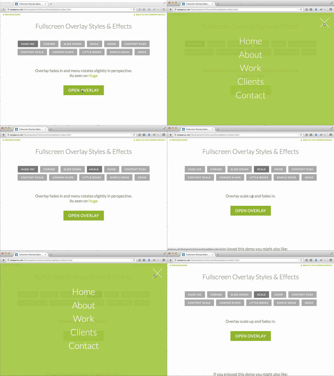
Holy crap, this is exact­ly what I need­ed the other day. I want­ed to do a GIF of the fullscreen over­lay tech­nique I linked to but the file size was ridicu­lous. Plus it was also a pain doing it the way I knew — QuickTime screen record­ing into Photoshop. I love sim­ple, sin­gle focused soft­ware like LICEcap — though I’m not thrilled about the name. I do love the price though, free.

LICEcap - Screen Capture GIFs, software, record screen, demo fullscreen overlay styles, animated GIF

And it’s GIF as in gift. If it was the other way it would be spelled JIF.
I don’t care what the inven­tor says.

(via DesignerNews)

Don’t Forget to Read This…

August 13, 2014 at 1:43 pm

This is such a good touch, so cheeky and funny. I was culling the myr­i­ad of tabs I had opened when I noticed some­thing odd about one. I did­n’t rec­og­nize the snip­pet of the title “Don’t for­get to r…” Sure enough, when I click on the tab, the tab title changed back to the arti­cle title. Very clever. Now back to actu­al­ly read­ing the arti­cle. (via Invision)

Changing web page title example, Firefox browser, multiple tabs, active vs inactive states

Net Neutrality Comments

August 6, 2014 at 2:45 pm

Maybe I’m in an exple­tive acces­si­ble mood, given the Samuel L. Jackson com­pi­la­tion the other day, but this felt good to read. The FCC released all the com­ments it received dur­ing the pub­lic hear­ing por­tion of its net neu­tral­i­ty pro­pos­al. Then The Verge cre­at­ed info­graph­ics for the more col­or­ful parts of speech used.

George Carlin (and Lenny Bruce) would be proud of us. In com­ments to the FCC, cit­i­zens used the com­bined list of sug­ges­tive, raunchy, rude, crude, lewd, and off-color terms a total of 8,289 times. Here’s a detailed break­down, plus a cou­ple of bonus words that are sure to offend the bureau­crats who have to slog through our anger.

My opin­ion on the mat­ter is that all traf­fic should be treat­ed equal­ly. It’s all the same — ones and zeros, bytes and pack­ets. Build and expand the infra­struc­ture to keep pace with demand. Plan and fac­tor those costs into doing busi­ness. Price ser­vices accord­ing­ly. It is amaz­ing how sim­ple that for­mu­la is, and yet how eas­i­ly inter­net ser­vice providers screw it up.