One Tuesday every month, I’m going to round up a couple (maybe a few) awesome display typefaces to showcase and give a little breakdown on each one. If you have a suggestion you want me to take a look at, drop me a line. Let’s jump straight into some headline goodness.
Foundry : Unknown
Designer(s) : Unknown
Cost: FREE

First on the list this month is not a font at all but an .EPS of over-the-top ornamental letters. They are full of texture and old world looks. They would work great as a drop-cap or blown up real big as a background element. There’s a ton of other great vectors of vintage engravings over on VintageVectors.com so go check them out.
Cost: $79

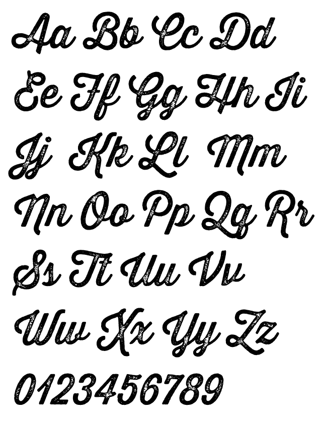
Next is the latest release from Sudtipos. I seriously cannot get enough from these guys. Sugar Pie is an amazing brush script with swooping curves that culminate in sharp pointed terminals. Nicely weighted strokes and plenty of personality let this type really hold a space which makes it perfect for packaging or point of purchase signage — especially in food related applications. And of course being from Sudtipos, there are plenty of extra alternate characters and ligatures to keep things interesting and help vary your words. So open up that glyph palette and dig into Sugar Pie.

Designer(s) : Marcus Sterz
Cost: $80 for a family of 4 styles

I’ve been holding on to this a few weeks after seeing it in a Typedia post. Marlowe is a family of four styles; the basis is an Art Deco sans serif. Then comes the variants — Cocktail, Swirl, and Escapade. They build on the regular in different ways, and its really hard to explain all of them. So take a look at the sample below to get a better idea. There’s also some OpenType ligatures and alternates through out the styles, so check those out too. Pick up copies on FaceType’s website or over on Fontspring with @font-face web licensing.


Quintet
Cost: Unknown

Last on the list this month is more an inspiration piece. For now, it’s still student work and not for sale anywhere. Part of the TypeMedia 2011 class, Kunihiko Okana has put together something truly amazing — a formal script with five variations built for layering and offsetting to build elegant headlines and display pieces. You have to go check out the portfolio page on TypeMedia2011.org to see more great combinations along with an accompanying Quintet Serif to carry body copy. You better believe as soon as this becomes available for use, I’m jumping all over it.

Final Mentions to Check Out