When the meteorologist giving you a weather forecast says, “This week’s temperatures are going to be a little warmer than usual,” they are referencing published observations from the National Oceanic and Atmospheric Administration (NOAA) U.S. Climate Normals. Every decade a new report is released that rolls the data forward sliding on a 30-year window. So right now, the meteorologist is comparing today to the average of 1981 to 2010. After the upcoming NOAA update in May, the comparison will be to the average of 1991 to 2020. Your daily weather report is a shifting baseline of climate change.
Alongside the questions about when the new Normals will be released (first week of May), we’ve gotten a lot of questions about the Normals and global warming. Is global warming affecting the Normals? (Yes). Are the Normals adjusted to “subtract out” global warming? (No.) So the new normal reflects our changing climate? (Yes). Then how do we keep track of what used to be normal? (Different analyses.)
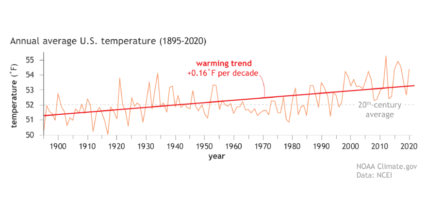
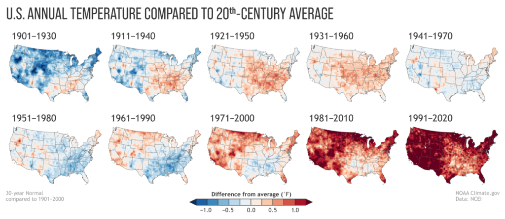
So what happens when you step back from the short sighted Normals and start doing that “different analyses?” (I know, I know — thirty years is short sighted? Yes. In the grand scheme of planetary science and millions of years, it’s a blip. We must think bigger.) You don’t have to look far because you can compare each update of the Normals starting from the first period of 1901–1930. Now with a century in the books, things look pretty bad.
Annual average temperatures have risen 2°F in much of the U.S.
Everywhere in the U.S. is warmer now than during the 20th century.
Precipitation is getting pushed to the extremes. Areas are 12.5% wetter or drier.
Planting zones are shifting northward and up elevations.
The planting zone maps emphasized a key point about the Normals and climate change: the once-per-decade update means these products gradually come to reflect the “new normal” of climate change caused by global warming. What’s normal today is often very different than what was normal 50 or 100 years ago.
Happy Earth Day!
(via kottke)