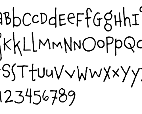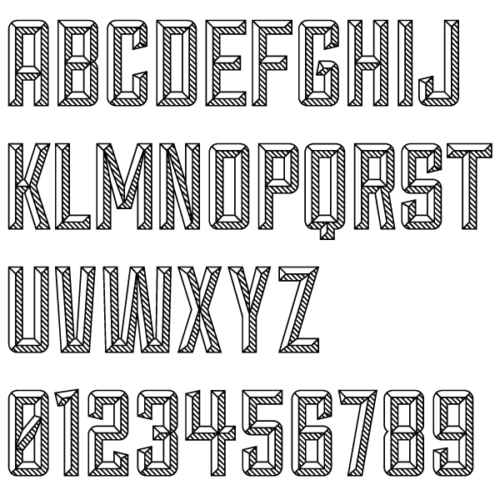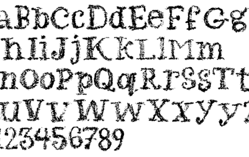
This month’s list is kind of short — only two typefaces stood out enough to warrant remarks. Both are handwritten but in very different aesthetics. To make up for the short supply though, I’ve included a short list of other resources that should be on your reading list (aka. my list of open tabs and bookmarks that I haven’t completely finished looking at myself.)

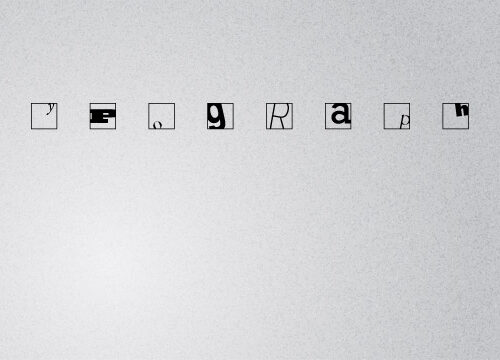
This month’s wallpaper is inspired by a project I remember doing my first year in college. You made a composition by cropping letters in squares and seeing how far you could push a letter before it just became unrecognizable shapes. It was a great introduction to legibility and attention to positive vs. negative space.

The best word that I ended up using to describe all three of this month’s display typefaces is… solid. They rely on sturdy lines or rigid construction principles or heavy, thick shapes to give them personality and the ability to carry a headline.

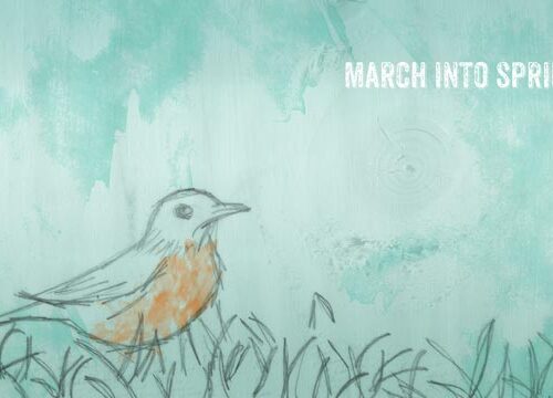
I’m a day late posting, but it’s for a good reason. Here are two wallpapers for this month of March! One is a harbinger of spring, the other a technical, blueprint style look at a computer hard drive. Enjoy!

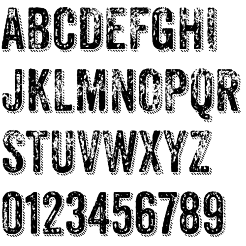
This month’s headlines span everything from a pixel based blackletter to a distressed sans-serif full of Opentype alternates. There’s even the perfect ruled, outlined, and drop-shadowed serif for when you want to try and make counterfeit paper money. Plus, if one blackletter font wasn’t enough, this month has two! You know you want to check it out.

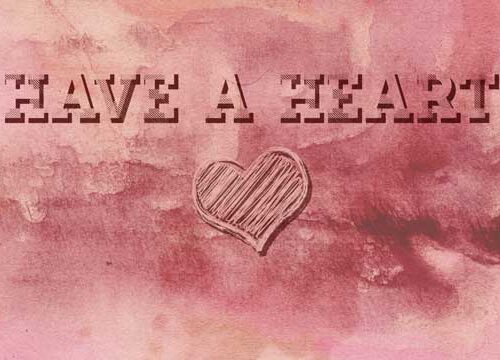
Oh, February. You wield the double edge sword of love with your Valentine’s Day. Please be kind and merciful with Cupid’s quiver of arrows. Will you please have a heart?
I sat down today to start sketching some ideas for a responsive web site design. Imagine my surprise when I searched for a simple, letter-sized template of window sizes only to find one result. I wanted something a little different, so I made my own. Download the PDFs to help with your own wire-framing.

It’s time to welcome in the new year with four display fonts that will help make your headlines really stand out. We’ve got two different script typefaces and a pair of comic relatives with fun personality — so check them out.
